Is Your Therapy Website Driving Clients Away? 20 Common Mistakes to Fix Now.

Is Your Therapy Website Driving Clients Away?
20 Common Mistakes to Fix Now.
As a therapist in private practice, have you ever wondered why some therapy websites seem to effortlessly attract clients while yours struggles to make an impact? After conducting an in-depth review, it became exceptionally clear that while therapists have made strides in improving their online presence, the vast majority are still lagging behind. We all have our website pet peeves, but users are less forgiving of subpar online experiences.
The truth is, with the right approach, your website could be the key to unlocking untapped potential and skyrocketing your practice. That's why I've compiled this comprehensive list of 20 common mistakes therapists make on their websites—because I believe every therapist has the opportunity to stand out amongst their peers and make a lasting impression.
Each mistake presents an opportunity for improvement and growth. So, if you're ready to take your therapy website from lackluster to exceptional, let's dive in and make this the year you transform your online presence for the better. It's time to turn those old, abandoned, ugly sites into powerful tools that drive clients through your door.
So, let’s fix those irritating website blunders that might be repelling your dream clients.
01. Complete and Utter Confusion
Websites that leave visitors scratching their heads are a big no-no. If your homepage doesn't shout out loud what you're all about within three seconds, you're in trouble.
02. Mobile Madness
You know what's worse than a bad hair day? Trying to navigate a website on your phone that's as clunky as an old jalopy. Don't subject your visitors to the pinch, zoom, and scroll dance routine. A smooth mobile experience isn't just a nice-to-have; it's essential for SEO and conversions.
03. It Doesn’t Work
A website with broken links or malfunctioning features? Ain't nobody got time for that! LITERALLY - Your visitors will jump ship as quickly as possible. Keep your site in tip-top shape, or risk losing clients.
04. Anxiety-Inducing Design
Therapists often aim for a soothing and calm website yet inadvertently clutter their sites with irrelevant content. Additionally, formatting issues like misaligned images and text create visual imbalance and inconsistency, leaving visitors disoriented and stressed. It's time to streamline your website for a more harmonious user experience.
05. Eye Strain Central
Ever squinted at a website because the font was so tiny you needed a magnifying glass? Or strained your eyes trying to read text that blends into the background like a chameleon? It's time to give your visitors a break.

06. Contact Confusion
How the heck do I reach you? Don't leave your visitors playing detective when it comes to contacting you. Make it clear how to get in touch, whether via carrier pigeon, smoke signal, or good old-fashioned email.
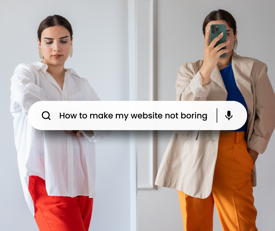
07. Boring is Out
If your website is boring, unclear, or uninspiring, you're handing potential clients over to the therapist down the block who knows how to speak directly to their needs and goals. Think about it—when researching therapists, we often categorize them into tiers. The top tier consists of those we feel deeply connected to, while the next level includes therapists we'd consider if our top choices aren't available. Unfortunately, the third tier therapists don't even make the cut. Be the therapist that clients can't resist!
08. No More Arial, Please
We left Arial in the '90s where it belongs. Time to give your font game a glow-up.
09. Double Trouble
Two spaces after punctuation? Let's leave that bad habit in the past, where it belongs.
10. Badge Overload
Are too many badges and credentials cluttering up your site? Less is more, folks. Quality over quantity, always.
I often see therapists adding badges without a second thought to design cohesion. It's like watching a toddler make a sandwich—peanut butter smeared on one corner, jelly oozing out the sides. The result is a mishmash of colors, fonts, and sizes that clash with your site's aesthetic. Instead of enhancing credibility, these badges look like an afterthought.

11. Phrases That Make You Cringe
Enough with the therapy-speak already! Let your personality shine through in your copy, and leave the jargon at the door.
Here’s a great article on how to make your copy less cringy: Does Your Website Pass the One Question Test?
12. The Ghost Town Effect
Outdated content on your site? Talk about giving off abandoned haunted house vibes. Keep your site fresh!
13. Brené Brown Overload
I love Brené as much as the next person, but let's not overdo it with the Brené Brown quotes. Your website should reflect you, not the Brené fan club
14. "We" Confusion
Confusing visitors with a "we" when it's just little ol' you? Keep it real and use "I" like the solo superstar you are.
15. Shoddy Images
Blurry, unrelated, or unprofessional images? Nobody is going to connect with that visual chaos.

16. Stock Photo Hell
Enough with the lotuses and sunsets already. Let's embrace unique stock photos and banish clichés to the website wasteland.
17. Jack of All Trades
There are two kinds of Jack of All Trades therapists:
“I want to work with EVERYONE!” - Offering services without a clear focus will have you casting a wide net but failing to stand out. Without a niche or focus area, your website is essentially invisible to Google.
“I want to do EVERYTHING!” - If you offer a buffet of services—therapy, workshops, consultations, training, speaking gigs, groups, you name it - clients may question your credibility and dedication to therapy if your time is spread thin across various endeavors. Also, if each service targets a different audience, you will not reach and engage with any one group effectively.
Your versatility may seem impressive, but streamlining and simplifying is essential for success in a crowded field.

18. Chest Puffing
Listing every credential under the sun? Excessive chest-puffing on a therapy website is usually counterproductive, as it may intimidate potential clients, hinder genuine connection, breed distrust, consume valuable space needed for conveying essential information, and lead to ineffective marketing strategies. While credentials are important for credibility, overemphasizing them will come at the cost of warmth, empathy, and relatability—qualities that clients value highly in their search for a therapist. Striking a balance between showcasing qualifications and conveying a genuine desire to help is crucial for creating a welcoming and effective therapy website.
19. "About Me" Overload
I’ve stumbled upon too many therapist websites where the "About Me" section feels more like a memoir than a professional introduction. Some of you get a little too personal, from childhood pets to favorite vacation spots, leaving potential clients wondering if they accidentally stumbled onto a social media profile instead of a therapy website.
20. Group Practice Maze
Stumbling upon a group practice website can initially feel like hitting the jackpot—the client is more likely to find a therapist who's the perfect fit. But that excitement quickly fizzles out when they realize that instead of finding the information they need easily, they’re stuck clicking through a collection of individual bio pages, unnecessarily wasting precious time and energy. Group practices should simplify this process by consolidating therapist bios onto one page, allowing clients to assess their options and make quick, informed decisions without hassle.
If SEO demands it, individual pages can still be an option, but make it easy for clients to find what they want!
The Absolute Worst Offenders
Let's learn from the cringe-worthy mistakes of others. (Yes, this shit is real.)
One website had a footer that was completely empty and extremely long. Did you forget something?
I once saw an advertisement for the website builder in the HEADER! It said: “This website was created by Wix.com website builder. Get your website today!” This cheapskate therapist obviously wouldn’t pay the hosting fee to have the tagline removed.
To describe their therapy approach, one therapist copied and pasted several paragraphs from their psychological theories textbook into their website.
One therapist made a Bitmoji of his face and used it as his portrait photo. I hope I don’t have to explain why this doesn’t work.
Your therapy website should reflect your awesomeness, not a digital nightmare. By ditching the pitfalls outlined above, you'll be well on your way to crafting a website that wows your clients. Now go forth and website like a boss!