How to Infuse Personality Into a Bland Therapy Website
Imagine replacing the stock photos on your website with pictures of U-Haul trucks, safety equipment, or accountants. Does it still “work”? In other words, does your site feel so generic that those images wouldn’t look completely out of place? If the answer is yes, it’s time for a change. Your website shouldn’t look like it could belong to a corporate law firm, a tech company, or a dentist’s office. Therapy is personal, but a bland website sends the exact opposite message—it feels detached, generic, and emotionless, like walking into a place where no one cares about your experience.
When your website could just as easily represent any business, it misses the mark entirely. Therapy clients are looking for a space that feels warm, inviting, and trustworthy—qualities that generic designs just don’t convey. Bland, one-size-fits-all design services are often the culprit, and unfortunately, they leave you with a site that fails to reflect your unique practice and doesn’t connect with your best-fit clients.
10 Ways to Infuse Personality Into Your Therapy Website
1. Soften the White
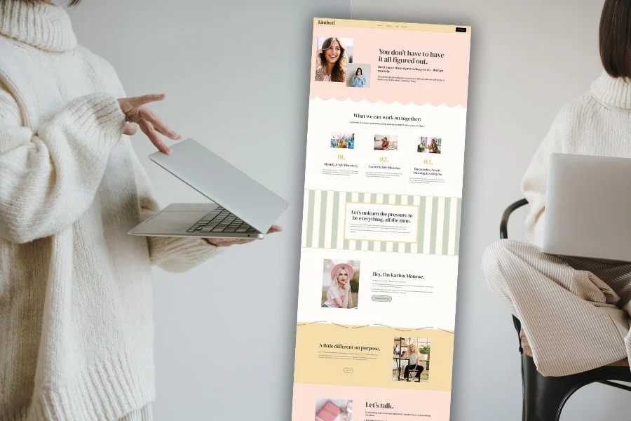
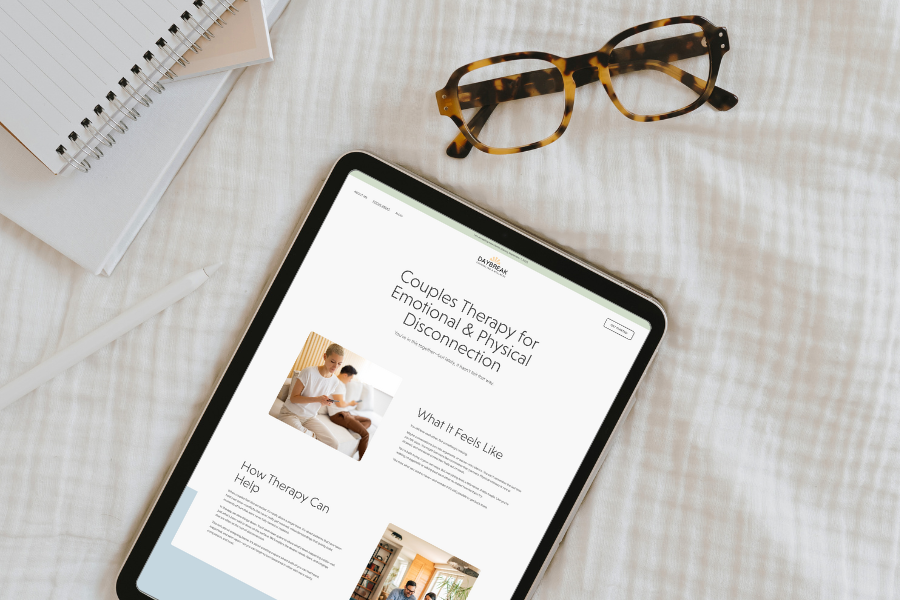
Bright white backgrounds often feel harsh, like the fluorescent lighting in a waiting room. By shifting the white to a slightly warm or gray tone, you can create a more inviting space without clients even realizing why it feels better.
For example, a website with stark white and bold black text might remind someone of a corporate handbook. Swap that for a soft, off-white (#FAF9F6) background paired with a muted charcoal for text. The subtle change creates a calmer, more human environment.
2. Choose Clean, Modern Fonts
The wrong font can instantly date your website or make it feel unprofessional. Overly decorative fonts (like script or serif-heavy styles) are often hard to read and can make your site feel cheap. Opt for clean, modern fonts that balance professionalism with warmth.
For example, instead of something overly ornate or outdated, try fonts like Poppins, Lora, or Nunito. Pair a serif for headers with a clean sans-serif for body text to create visual interest without sacrificing readability.
3. Create Balance with a Grid
A cluttered layout feels chaotic, while an overly rigid design feels sterile. Instead, aim for balance by imagining your site as a grid. Place elements like text, photos, and buttons thoughtfully, leaving room for blank space to help everything breathe.
Think of it like decorating a bookshelf—group some items together, leave space around others, and vary the sizes to avoid monotony. For example, if you have a photo and a text block side by side, offset them slightly instead of centering everything perfectly, creating a sense of dynamic flow.
4. Use Conversational Copy
Your copy should feel like a genuine conversation, not a generic advertisement. Avoid therapist clichés like “Find clarity, confidence, and calm.” Instead, let your unique personality and tone shine through.
For example, instead of saying, “I can help you achieve your goals,” try something like, “Life doesn’t come with a manual, but together, we can figure out how to make it work for you.” This kind of language feels relatable, approachable, and human.
Click here to learn more about choosing color palettes for your therapy website
5. Update Your Color Palette
Certain colors—like navy and gray—feel cold and corporate when used alone. To modernize your palette, pair traditional hues with bold, fresh accents.
For instance, if you love navy, pair it with bright teal, mustard yellow, or fuchsia pink to add energy and warmth. These unexpected combinations create visual interest and make your site stand out.
6. Use Graphics Sparingly and Intentionally
Graphics and icons can add visual interest and personality, but too many can quickly clutter your site. Think of them as sprinkles on a cupcake—small, intentional touches in just the right places.
For example, a single hand-drawn sunburst next to your headline or a subtle wave divider between sections adds charm without overwhelming the design. Avoid scattering icons everywhere, as it can feel like an overload of visual noise.
7. Add Softness
Sharp edges and hard lines can make a website feel rigid and unapproachable. Adding softness through rounded corners, organic shapes, and natural imagery creates a sense of ease.
Imagine swapping out a rectangle button for one with rounded edges or using a circular photo frame instead of a square. Add organic-looking graphics like watercolor washes or hand-drawn dividers to create a more welcoming aesthetic.
8. Replace Depressing Stock Images
Stock photos of people looking sad or anxious reinforce the problem instead of inspiring hope. Use images that represent what life could look like with therapy—calm, happy, and empowered.
For instance, instead of a photo of someone sitting in a dark room with their head in their hands, choose an image of someone walking through a park, journaling in a sunny café, or laughing with friends. These visuals paint a picture of what’s possible.
9. Break Up Text (and Use Blank Space)
Large blocks of text are overwhelming and can cause readers to bounce off the page. Breaking up your content with headers, color blocks, and images keeps it engaging and easy to navigate.
Think of your site like a journey. Visitors want to feel like they’re making progress, not sitting in traffic. Adding blank space between sections gives everything room to breathe, making the overall design feel lighter and more inviting.
10. Add Micro-Interactions
Micro-interactions are subtle animations or hover effects that add life to your site without being distracting. Done well, they feel intentional and modern.
For example, a button that gently changes color when hovered over or a photo that zooms in slightly as you scroll creates a sense of engagement. Avoid anything too flashy, like bouncing text or spinning graphics, which can feel gimmicky. The goal is to add small, thoughtful touches that enhance the user experience without stealing focus.
Your Website, Your Story
A website is more than just a place to display your services—it’s an opportunity to connect with clients and show them what makes your practice unique. By infusing personality into your site, you can create a space that feels warm, inviting, and reflective of the care you provide. Don’t settle for generic design when your website can be a powerful extension of your practice.
Ready to upgrade your website? Explore templates that combine personality and professionalism for a fraction of the cost of custom design.


