From Calm to Captivating: 10 Unexpected Color Palettes for the Modern Therapy Website
Therapist websites often feature similar calming designs with soft blues, gentle greens, and peaceful images, promoting a sense of comfort. However, clients want more than just tranquility. When I searched for a therapist, I looked for creativity, inspiration, and a bit of quirkiness. My ideal therapist has a lively personality, uses humor, and stands out.
If your work goes beyond relaxation, a typical calm website may not fully represent you or your clients' needs. What else do you want your website to convey? Creativity, courage, or uniqueness? Picture a site that makes visitors feel recognized and understood. By moving away from the usual muted tones, you’ll create an online presence that truly reflects your practice.
Imagine a website that takes visitors on an emotional journey. Unexpected colors and designs can inspire feelings, spark curiosity, and encourage action. This strategy will attract clients who connect with your unique approach. While serene scenes have their place, let's aim for something deeper. We can use colors that match your practice’s energy. Below, you'll find 10 color schemes to inspire your therapy website and infuse it with personality while still offering warmth and comfort.
10 Unexpected Color Palettes for the Modern Therapy Website
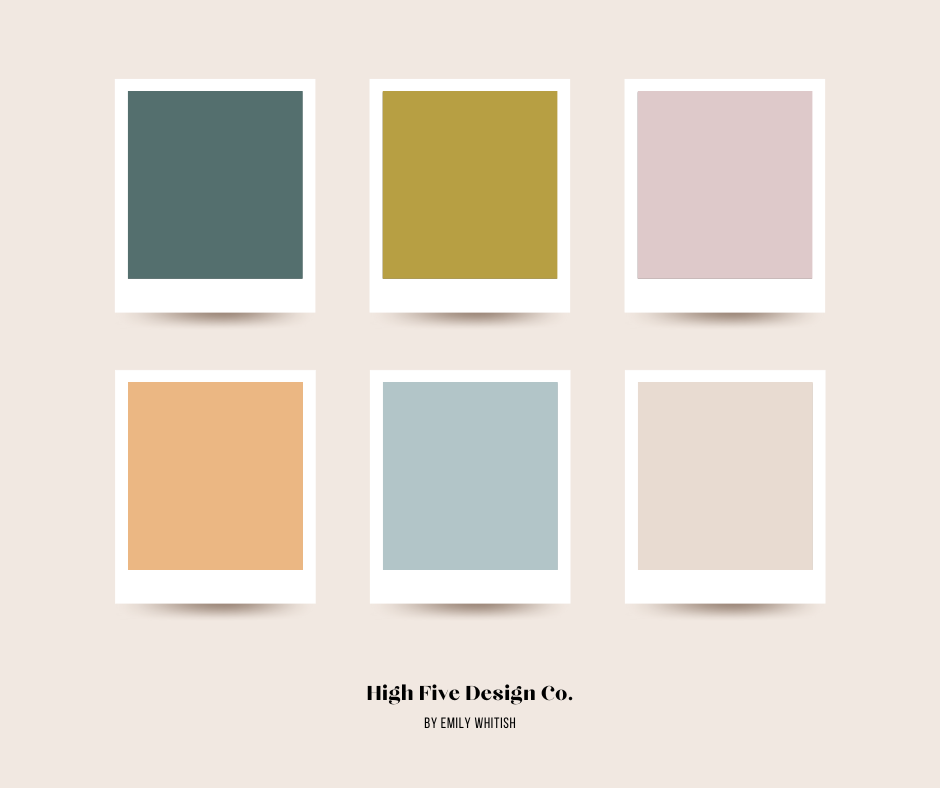
Teal With a Twist
These colors redefine calm with a twist of vibrancy. With its deep teal anchoring the scheme, accompanied by hints of earthy gold and soft blue, this palette offers a sense of grounding and stability. The light blush pink and medium warm peach inject a touch of softness, while the warm beige ties it all together with a cozy embrace. Therapists might choose this palette to communicate a blend of serenity and energy, offering clients a space that feels both grounded and invigorating. It speaks to a therapist who is not afraid to explore the depths of emotions and encourages growth and self-discovery.
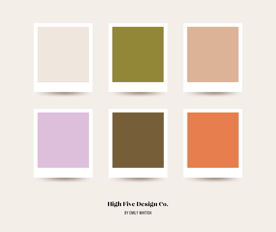
Earth Fusion
Earth Fusion blends the richness of earth tones with a pop of energetic warmth. The clean beige forms a comforting base, inviting visitors into a space of ease. The green adds a touch of nature, while the warm pinkish tan adds softness and approachability. Lavender lends a subtle hint of whimsy and creativity, balanced by the depth of deep brown for grounding. The unexpected poppy/coral red adds a burst of vitality and passion. Therapists might choose this palette to convey a space that feels both sophisticated and inviting. It invites clients to explore a space where comfort meets creativity.
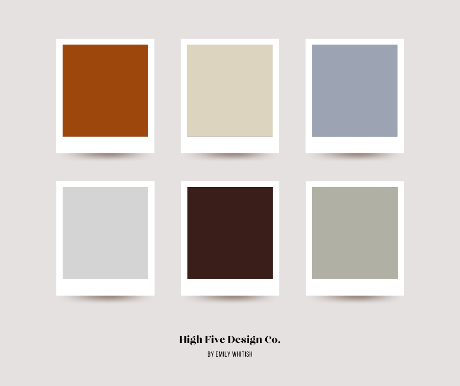
Warm Regards
Warm Regards is the warmth of a crackling fire on a winter's night. Deep red captures the passionate glow, with beige adding a touch of softness and light, like dancing flames against a hearth. The blue and green are like a peaceful winter evening and the smell of pine needs. The deep plummy brown adds richness and depth - like a well-loved armchair. Therapists might choose this palette to create a space that feels like a warm hug. It invites clients to unwind in a space where healing is found in the gentle balance of warmth and comfort.
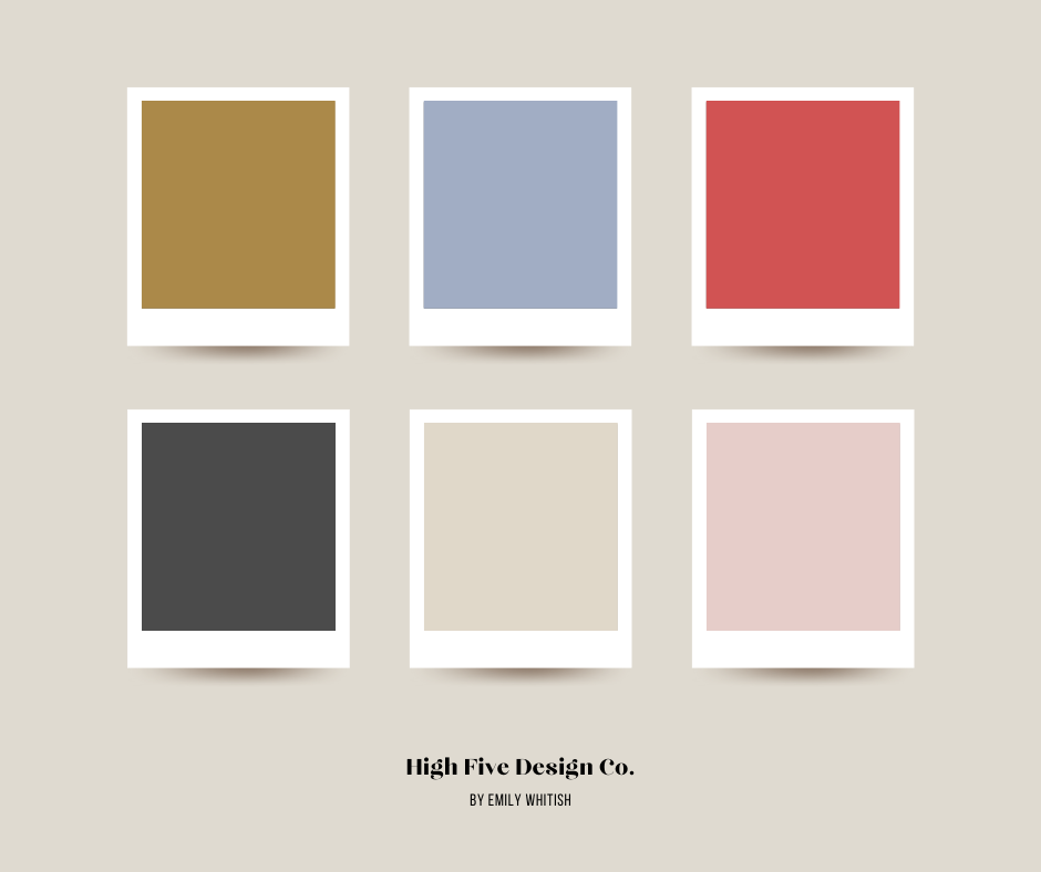
Nostalgic Nights
Nostalgic Nights reminds me of the fleeting moments of twilight and the magic of an evening sky. The last rays of sunlight cast a warm and inviting glow. The sky at dusk, holds the calm before the night falls. Almost-black charcoal brings depth and mystery, hinting at the quiet beauty of the approaching night. Warm beige offers a sense of grounding and comfort, and this pink adds a touch of nostalgia. The surprise: Vibrant red adds a bold and passionate accent. Therapists might choose this palette to create a space that feels like an evening retreat, offering clients a moment of deep reflection.
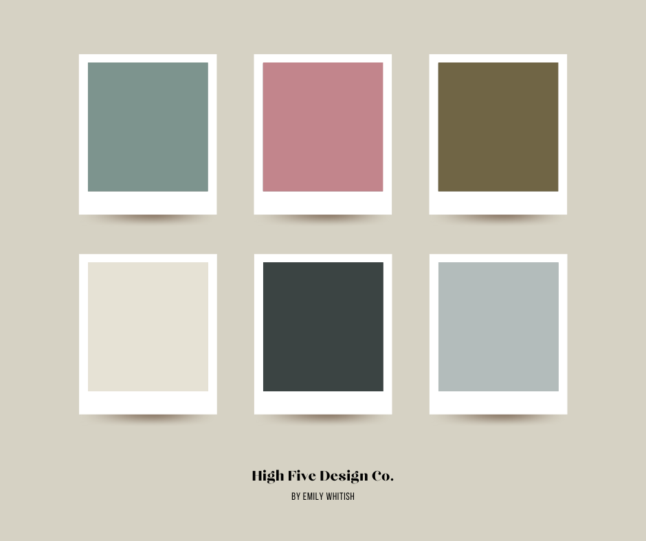
Magic Forest
Magic Forest paints a picture of a mystical woodland. The blue-greens embody the lush foliage of the forest, offering a refreshing and calming presence. Warm rose pink is delicate, like the petals of woodland flowers. Light beige offers a soft and gentle backdrop, and the darkest tones add depth like rich soil and ancient trees hinting at hidden secrets within the forest's depths. Therapists might choose this palette to create a space that feels like an enchanting journey into your wild and mysterious psyche.
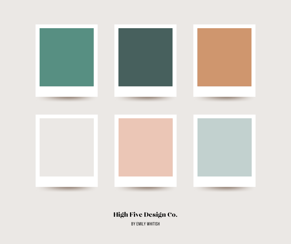
Ocean Oasis
If you love the idea of a website with tranquil waters and sandy shores, this palette offers that and a little punch of something playful. The darker empress blue captures the ocean depths and the marine teal green adds a refreshing and invigorating touch. Light beige (instead of bright white) and unsaturated terracotta offer a sandy earthy foundation, grounding the palette with warmth and comfort. The pink is like a flamingo traipsing playfully through the sand. Therapists might choose this palette to create a space that feels like relaxation, renewal, and a touch of playful whimsy.
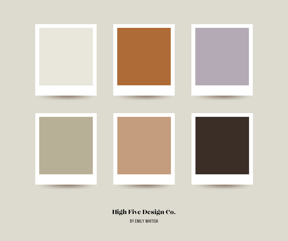
Quiet Canyon
Quiet Canyon captures the essence of a desert canyon at dusk, blending warm, soothing earth tones with a trio of unique and captivating colors. The two beige colors form a soft and grounding base, reminiscent of sun-kissed sands. Black adds depth and contrast, echoing the shadows cast by towering canyon walls. Yet, it's the grayish violet that whispers of the desert's quiet mystique, evoking the cool, dusky hues of twilight. Warm orangey colors dance like the last rays of sunlight and fiery passion, mirroring the rich colors of a desert landscape at twilight. Therapists might choose this palette to create a space that feels like a journey into adventure, warmth, awe, and discovery.
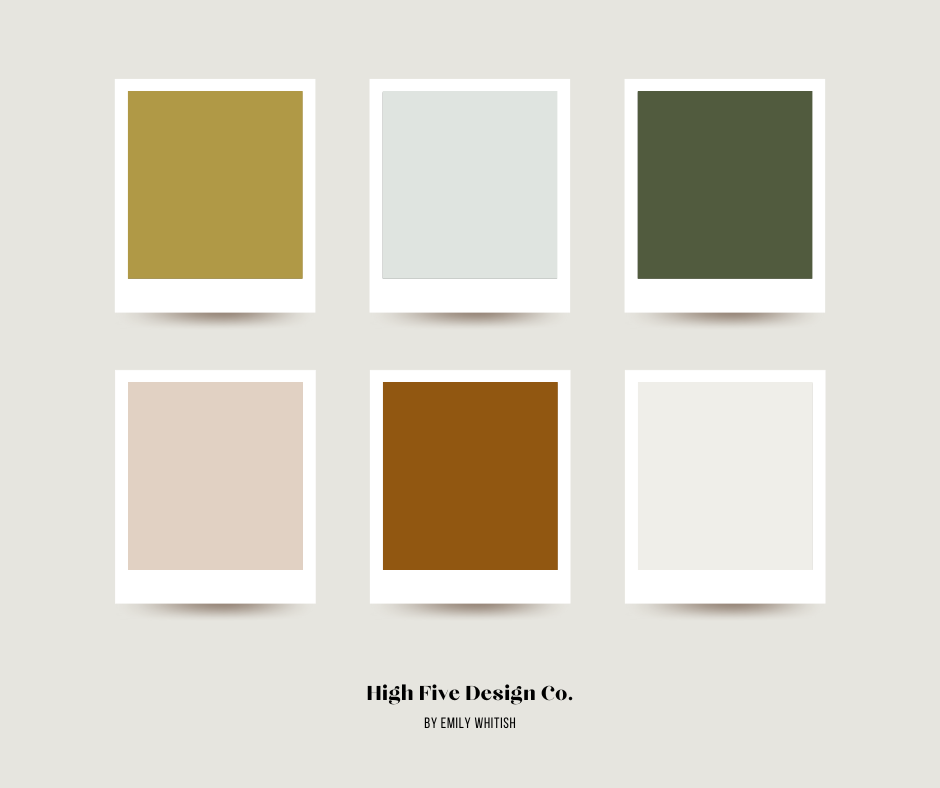
Retreat
Retreat invites you into a realm where soft pastels mingle with bold, earthy shades for a harmonious blend of tranquility and vibrancy. It is hidden forest streams, woodland blossoms, and sunlight dappled through the dense forest. Brick red adds rustic charm and dark juniper green envelops you in the mysterious depths of the forest, beckoning exploration. Clients will find safety, respite, and curiosity wandering through the forest leaves of this color palette.
Awakening
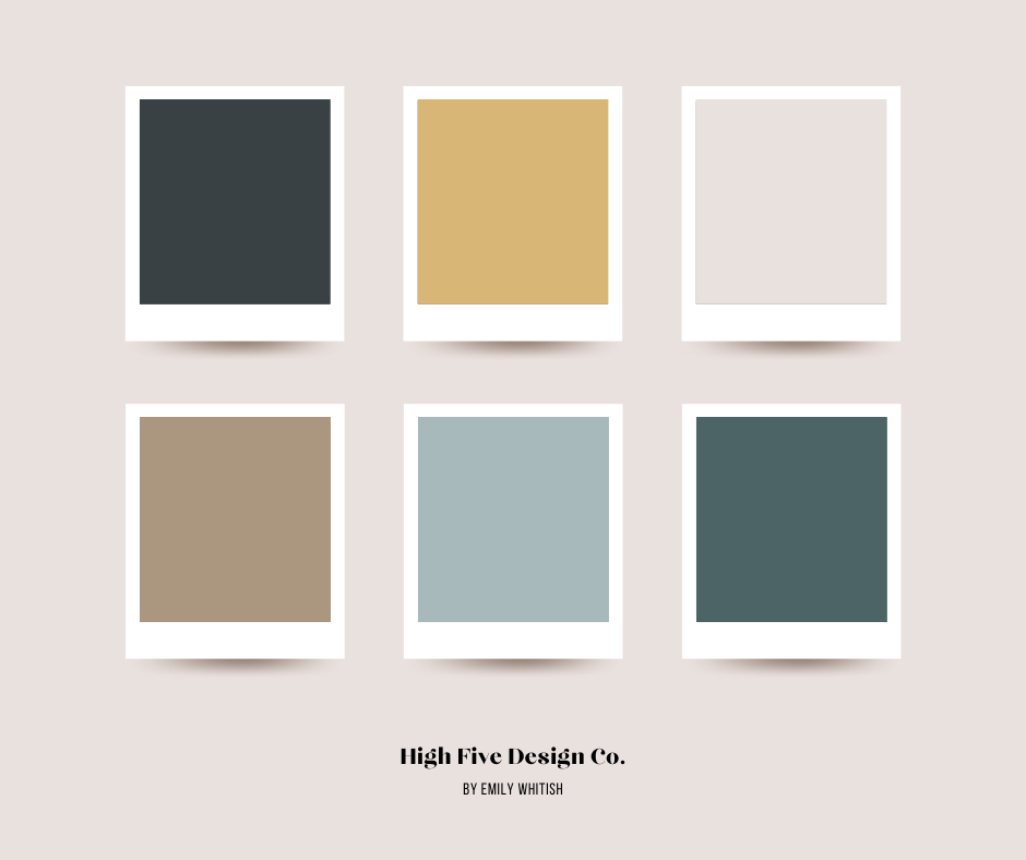
This color scheme ushers in the fresh, vibrant smells of early spring, when nature begins to stir from its winter slumber. It is the crisp skies of the season, promising new beginnings and endless possibilities. The yellow bursts forth like daisies, bringing a cheerful warmth to the palette. You might choose this palette to create a space that feels like a breath of fresh air, offering clients a sense of renewal, hope, and joy. Perhaps you help clients awaken their senses and see the beauty of new beginnings.
Bubbly
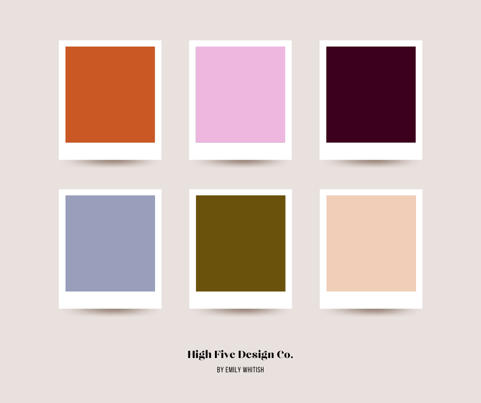
One of my favorite challenges in design is creating impact with unexpected color combinations, but choosing colors that play off another in a dance of contrast and cohesion. In this palette, red commands attention while the slate-heather adds a sense of modernity. Enter the bright lavender-pink, which brings joy and playfulness. Finally, the champagne peach adds elegance, like a shimmering glass of bubbly in the evening light. Against the backdrop of the two darker shades of brown, these colors meld into a celebration of individuality, boldness, sophistication, and charm. It speaks to those who appreciate confidence, style, and self-expression.
Need More Inspiration?
Check out these popular inspo posts:
8 Inspiring Therapist Website Examples You Need to See Right Now (2025)
5 Examples of Gorgeous Therapy & Coaching Websites to Inspire Your Design
My Favorite Design Hacks for Customizing Your Squarespace Website
10 Brilliant Examples of Hero Sections for Your Therapy Website Home Page
10 Gorgeous Color Combinations to Try on Your Therapy or Coaching Website
24 Awesome Brand Moodboards to Inspire Your Therapist Website Design
My Favorite Private Practice Tools
Resources and Referral LInks
High Five Design Co. by Emily Whitish is a design and digital marketing company in Seattle, WA. I specialize in Website Templates and custom One-Day Websites for therapists, counselors, and coaches.
