Why Therapists Don’t Need a Logo (and How Minimalist Branding Can Be More Effective)
Do you feel pressured to create a logo as part of building your brand? Yeah, me too. Logos are often seen as an essential part of professional branding. But when it comes to private practice, a logo isn’t just unnecessary; it can actually work against you.
When therapy websites are overly branded, they can start to feel corporate, distant, or impersonal. But when branding is subtle and minimal, the result is a clean, welcoming, and professional design that allows potential clients to connect with the actual therapist. In this post, we’ll explore why skipping a logo (or keeping branding ultra-minimal) can help your practice feel more authentic and inviting.


The Problem with Over-Branded Therapy Websites
Therapists often feel like they need a logo because they want to look professional, stand out in a crowded field, or create brand recognition. However, heavy branding, like in the example above, can sometimes backfire.
A website that leans too heavily on branding elements—bold logos, excessive graphics, multiple colors and fonts—can feel more like a corporate wellness company than a personal, welcoming space for therapy. It may unintentionally create emotional distance between the therapist and the client.
A strong brand isn’t about having a flashy logo or trendy design elements. It’s about creating a feeling of safety, trust, and connection through intentional design choices that let your message shine through without distraction.
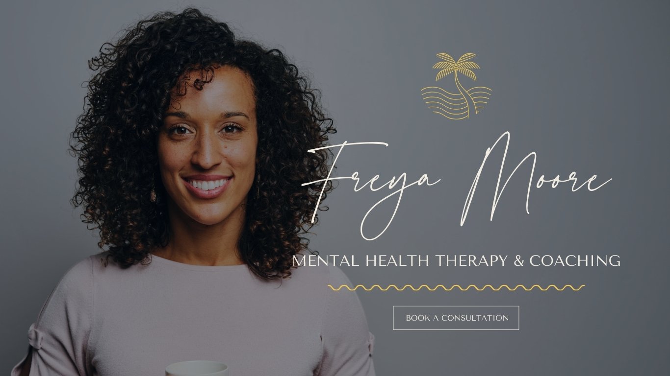
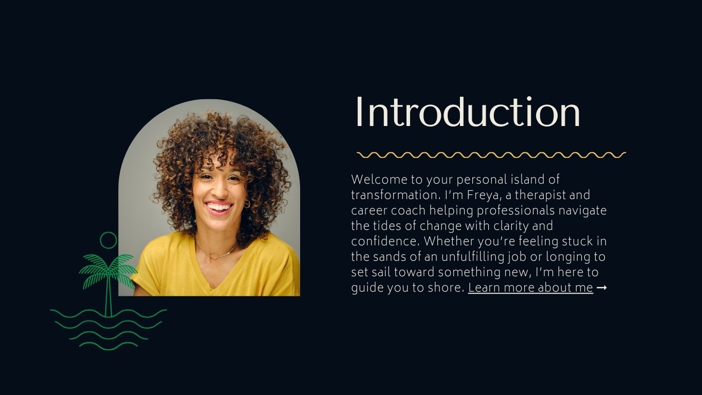
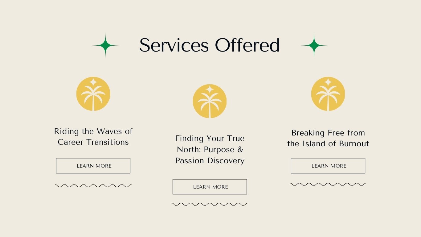
Above is an example of an over-branded therapy website. Freya Moore's website design suffers from an overuse of thematic branding elements that, instead of reinforcing her professional identity, create a visually overwhelming and inconsistent experience. The combination of multiple palm tree graphics, squiggly lines, shaped photo frames, and layered graphics—alongside an oceanic metaphor woven throughout the text—dilutes the clarity of her message and makes the branding feel forced rather than natural. The use of different decorative elements (stars, waves, squiggles, palm trees) competes for attention, making it difficult to establish a cohesive visual hierarchy. Additionally, the script font for her name contrasts sharply with the modern sans-serif fonts, creating a disconnect in tone. While her color palette is generally harmonious, the heavy layering of visual motifs on nearly every section—paired with multiple photographs of Freya—reduces the impact of each individual design choice. Simplifying the layout, reducing redundant brand elements, and using oceanic imagery more sparingly would create a more polished and professional aesthetic.

How Minimal Branding Creates a Stronger Connection
There is a huge difference between heavy branding and light, intentional branding. A website with minimal branding feels calm, clear, and inviting—exactly the emotions you want to evoke in potential clients. Instead of being distracted by an elaborate logo or intense design elements, visitors can focus on what really matters: your words, your philosophy, and the sense of safety you create.
A clean, simple website creates a sense of trustworthiness. The absence of heavy branding actually makes the therapist feel more present and accessible.
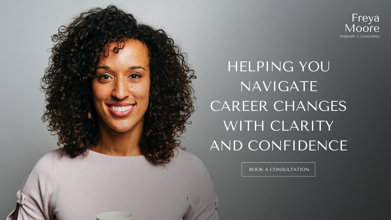
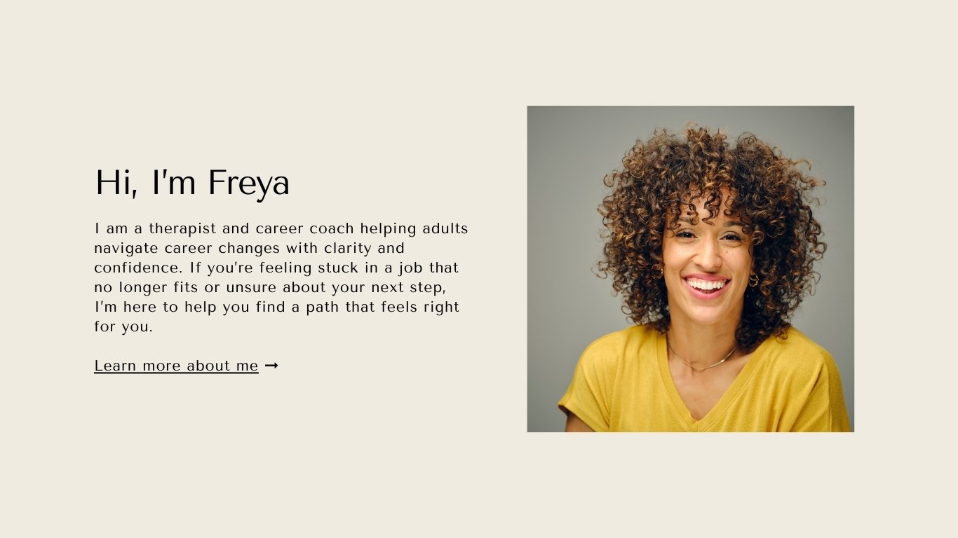
This updated version of Freya’s website (above) is significantly stronger because it embraces simplicity, clarity, and intentional branding while eliminating unnecessary decorative elements. Here’s how:
The cleaner hero section allows the headline to stand out as the primary message, placing Freya at the center without overwhelming the space with competing graphics.
The minimalist text-based logo in the upper right corner keeps branding subtle yet professional.
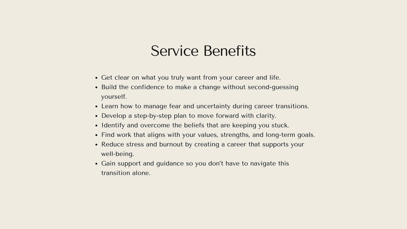
By replacing excessive ocean-themed visuals with strong, structured layouts—like square images of ideal clients and a standard bulleted list—the design prioritizes clarity and user experience.
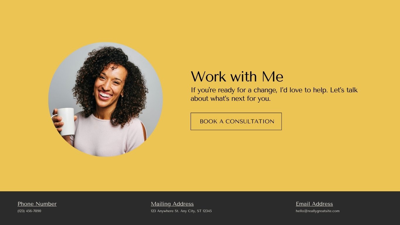
The use of yellow in key sections, such as the specialization and call-to-action areas, creates a warm, inviting flow while subtly reinforcing brand identity without relying on excessive motifs.
The thoughtful use of color, negative space, and a cohesive font system allows the content to breathe, making it easier for visitors to navigate and absorb key information.
By removing the ocean/island theme altogether, the site feels more timeless, adaptable, and directly aligned with Freya’s expertise rather than a forced metaphor.
This presents a more polished, professional, and approachable version.

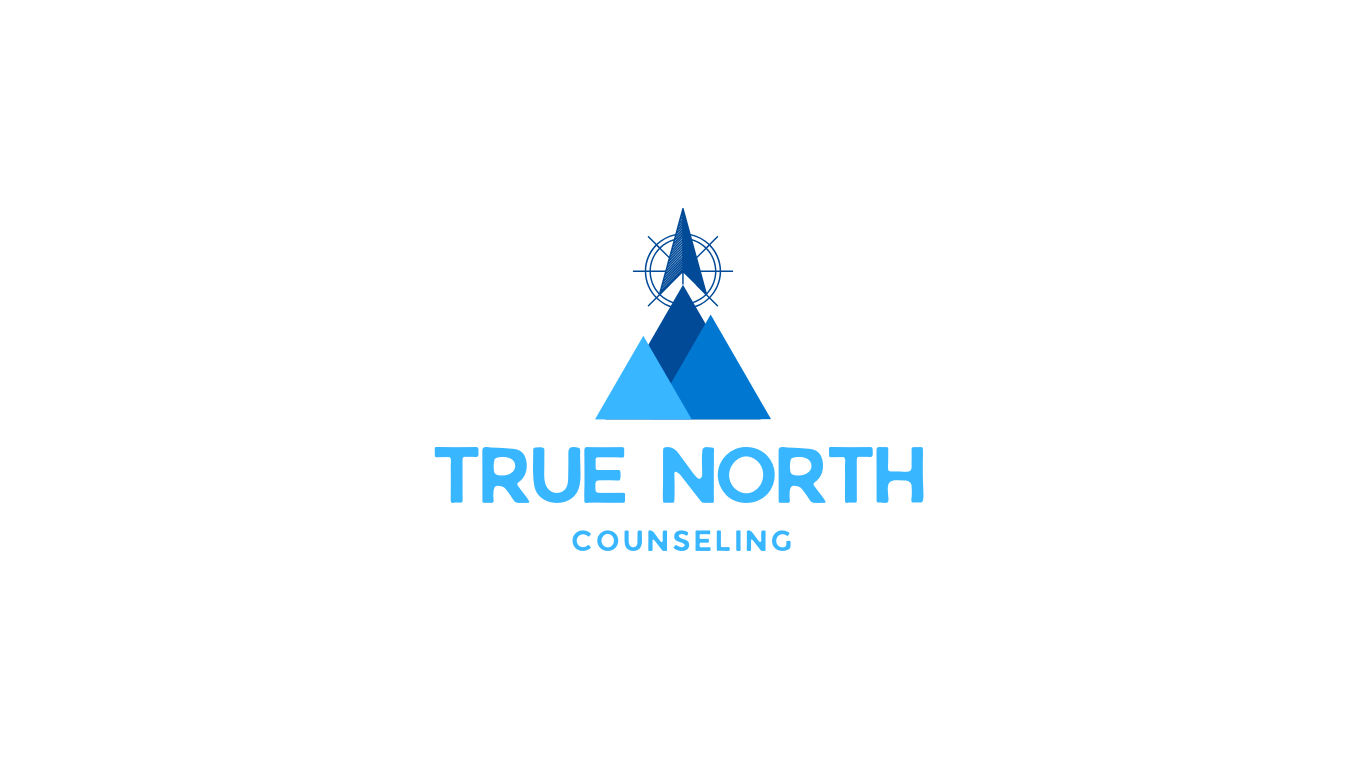
An example of group practice with a practice name and text-based, minimal logo.
Why Group Practices Don’t Need a Logo Either
Many group practice owners assume they need a logo because their practice name is different from their personal name. While this makes sense for allowing therapists within the practice to develop their own professional identities, a logo still isn’t necessary.
Instead of investing in an elaborate logo, group practices can focus on:
Choosing a practice name that is clear, calming, and inviting (e.g., Pinnacle Therapy Collective or Horizon Counseling).
Using a thoughtfully chosen font for the practice name rather than relying on a graphic-heavy logo.
Keeping branding minimal so that individual therapists within the practice don’t feel overshadowed by a corporate identity.

An example of a practice without a logo. They have opted to simply use their heading font in all caps in place of a logo.
Reasons to Skip the Logo (or Keep Branding Super Minimal)
Your Name (or Practice Name) is Enough: People connect with who you are, not a graphic.
Logos Can Feel Generic: Many therapy logos look the same (trees, lotuses, abstract swirls), making it hard to stand out authentically.
Simplicity is More Timeless: Trendy logos quickly feel outdated, requiring rebranding.
Easier and More Affordable: Skipping a logo removes a common barrier to launching your practice.
Less Distraction, More Clarity: Clients focus on you, not your visuals.
More Cohesive Brand Identity: A strong brand can be built through fonts, colors, and messaging alone.
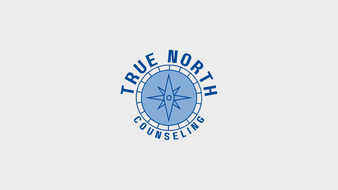

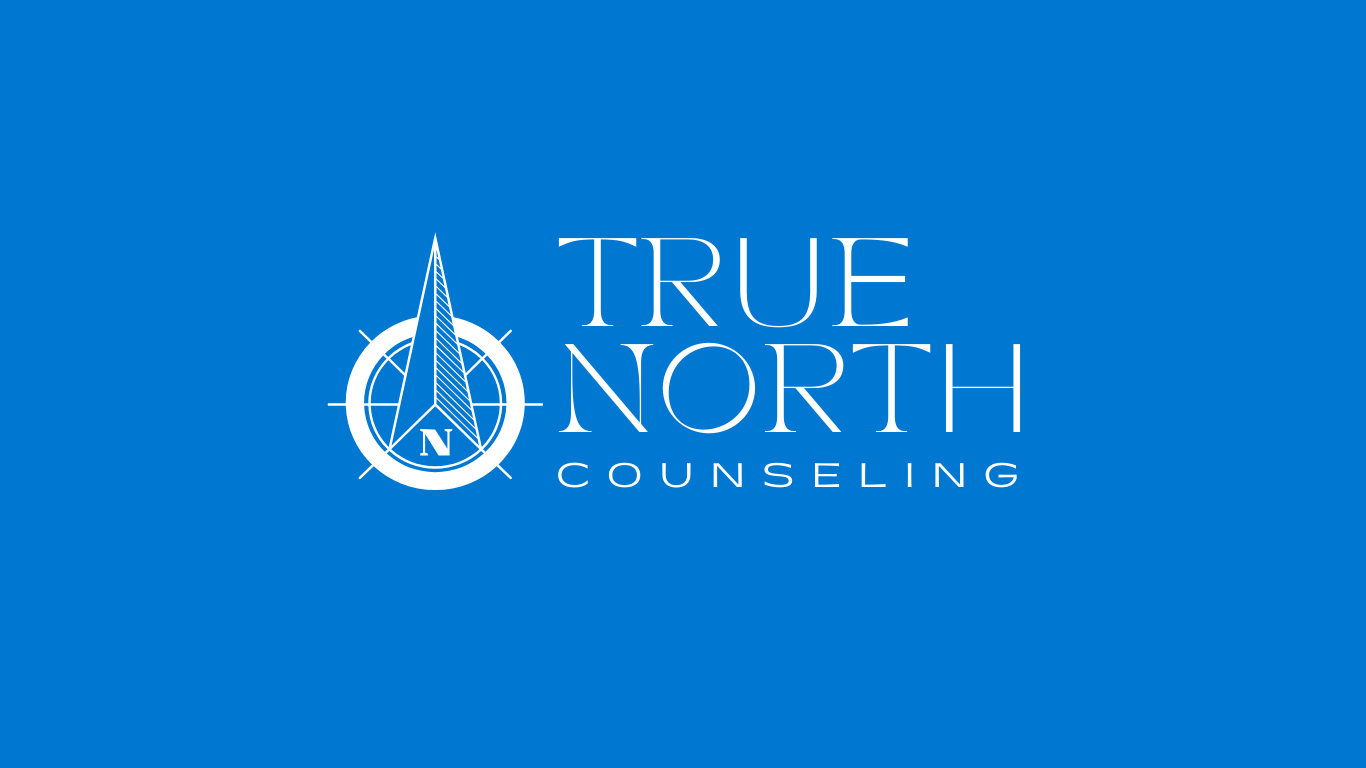

Five logo variations for True North Counseling, ranging in simplicity and complexity. While you might be drawn to more than one, I find the text-only version most impactful due to its clean, distraction-free design.
When a Logo Can Work (Without Feeling Corporate or Distracting)
If you really want a logo, it should still align with the personal nature of therapy. A good therapy logo should be:
Subtle and calming – Soft, organic shapes rather than sharp, corporate lines.
Typography-based – A well-chosen font with slight customizations can be more effective than a complex graphic.
Symbolic, but not overused – If using an icon, avoid clichés like trees, lotus flowers, and abstract people hugging. Instead, consider:
A hand-drawn element (soft lines feel more human).
A nature-inspired shape (mountain, wave, horizon, but kept minimal).
A delicate monogram or simple line art.


How to Create a Cohesive Brand Without a Logo
Choose a Signature FontA clean, modern font for your name creates a simple yet recognizable identity.
Stick to a Limited Color Palette2-3 calming, professional colors work best.
Keep Your Website Clean & UnclutteredPrioritize whitespace and readability.
Use Professional Yet Approachable PhotosYour presence is more powerful than any graphic.
Let Your Message Be the FocusClear, client-centered copy matters more than visuals.
A Call to Simplify
A well-designed website with thoughtful fonts, colors, and layout is enough—no logo needed. Therapists don’t need to overcomplicate their branding to be memorable. Instead, by embracing simplicity, you create a practice that feels warm, inviting, and focused on what truly matters: the connection between therapist and client.

Pin it!