6 Signs It’s Time to Redesign Your Website
Your website is like the online version of your office. Would you welcome a new client into a space with peeling wallpaper, a wobbly chair, and a filing cabinet from the '80s? Of course not!
So why let your website give off those same outdated vibes?
If your site is feeling more “grandma’s attic” than “modern, welcoming practice,” it might be time for a glow-up. Here are six signs it’s time to kick that old site to the curb and embrace a design that works for you—and your clients.
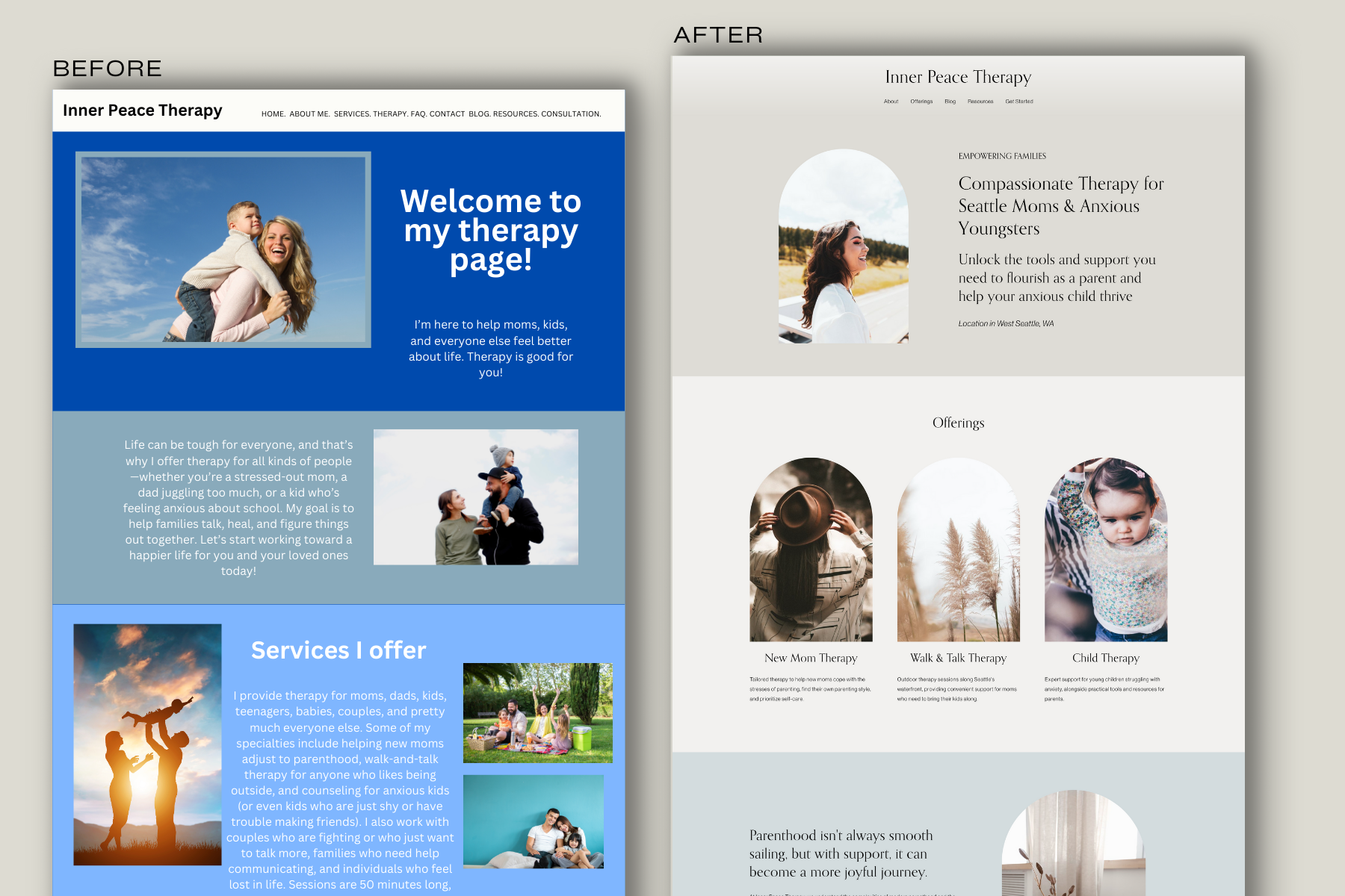
1. It Looks Dated
Web design has changed a lot over the years, but the good news is that a modern, thoughtfully designed website can stand the test of time. That said, many websites haven’t been touched in ages, and, well, it shows. Outdated fonts, clunky layouts, tired color schemes, and cliché stock images can give off a “blah” impression instead of a “wow” one.
Even if your site looks “fine,” it might not feel modern, engaging, or like a true reflection of your practice. Maybe when you first built it, you didn’t realize how much a website could (and should) represent your unique approach or the clients you want to attract. If your site feels more like a placeholder than a professional, welcoming space, it’s time for an upgrade.
2. It’s Cluttered and Confusing
Let's talk about decluttering—your website, not your closet (although, if your sweater pile is toppling over, maybe that too). Some therapists pack their sites with so much content that visitors feel like they've opened a Cheesecake Factory menu—overwhelmed by endless options. Others keep it clean and simple, but for those in the "too much" camp, here's a gentle reminder: less is more.
Your website needs to account for two key things:
Where your visitors are in their decision-making process.
Potential clients don’t need to know your detailed cancellation policy or the history of cognitive-behavioral therapy. Save that for intake forms or your first conversation. Instead, focus on what helps them decide if you’re the right therapist for them: who you help, how you help, and why they should choose you.Your site should focus on one audience and one function.
Your website is for potential clients—period. Resist the urge to cram in resources for current clients or general public education. Resource pages that send people off your site? Big no. A clutter of extra info for current clients? Also no. Your website should have one purpose: to guide potential clients to take the next step in working with you.
If your site feels like it’s trying to do everything at once, it’s time for a declutter. Streamlining your content can make the experience smoother and more intuitive for visitors, turning confusion into confidence—and browsers into clients.
3. Clients Aren’t Booking
Your website’s main job is to connect you with clients. If inquiries have slowed or stopped altogether, it’s worth investigating why.
First, consider whether people are even finding your site. Without proper SEO (search engine optimization), your site may not be appearing in search results, which means potential clients aren’t seeing it at all.
If you’re getting traffic but no inquiries, it’s time to look at what might be turning visitors away. Tools like website analytics can give you clues:
Are people leaving your site quickly? This could mean your content or design isn’t engaging, or the info isn’t relevant to them.
Are they not clicking on buttons like “Book a Consultation”? Your call-to-action might not be clear or inviting enough.
Is there a specific page where people often leave your site? Something about that page—whether it’s the design, content, or tone—might not be resonating.
Even a few minutes spent reviewing basic data like page views, button clicks, and how long people stay on your site can reveal what’s working and what’s not. Small tweaks to your content, design, or calls-to-action can make a big difference in turning visitors into clients.
If you’re not sure where to start, think about what a potential client needs most from your site: reassurance, clarity, and an easy way to take the next step. Does your site deliver? If not, it’s time to rethink your design.
4. You Can’t Update It Easily
Do you dread making updates to your site because it’s too complicated or time-consuming? A modern website should make your life easier, not harder. If adding a new service or tweaking your bio feels like pulling teeth, it’s a sign that your platform or design needs a refresh. A user-friendly site saves time and lets you focus on what you do best—helping clients.
Squarespace: Beautiful, professional templates and intuitive drag-and-drop editing, but limited customization options for high-level website developers compared to other platforms.
Wix: Highly customizable with a simple drag-and-drop builder, but the vast array of features can feel overwhelming for beginners.
Weebly: Straightforward interface perfect for beginners, but lacks the design flexibility and advanced features of other platforms.
WordPress.com: Offers a wide range of themes and plugins for scalability, but has a steeper learning curve for those new to web design.
GoDaddy Website Builder: Quick setup with built-in tools for small business sites, but templates are less polished and design capabilities are more limited than competitors.
5. It Doesn’t Reflect Your Practice
Your practice evolves, and your website should evolve with it. If your site no longer aligns with your services, values, or style, it can confuse potential clients. Maybe you’ve started offering online therapy or expanded your specializations, but your site still screams “in-person only.” A redesign lets you create a site that truly represents your current practice.
6. It’s Costing You Credibility and Money
Your website speaks volumes about you before you even meet a client. Every design choice, sentence, and detail on your site sends a message—whether you mean it to or not. For therapists, who rely on trust and professionalism, a poorly executed website can unintentionally communicate the wrong things to potential clients.
Here are some common mistakes and the messages they send:
Inconsistent formatting or typos: This can suggest a lack of attention to detail, which is not a quality clients want in someone helping them navigate sensitive issues. If you’re not thorough with your website, how can they trust you’ll be thorough in their care?
Copy that’s all about you, not the client: Writing extensively about your education, theories, and personal journey without addressing client concerns can come across as self-centered. It may leave potential clients feeling like their needs aren’t the priority.
Outdated design or clunky navigation: A site that’s hard to use or visually outdated can signal that you’re not up to date or invested in your work. Clients may wonder if this reflects how you approach therapy as well.
Generic or vague messaging: Phrases like "I help people with their problems" or "Everyone is welcome" are too broad to connect. They might leave clients questioning whether you truly understand their unique struggles or if you’re the right fit.
Distracting or irrelevant elements: A cluttered page with unnecessary links, overly bright colors, or irrelevant information can feel overwhelming and unprofessional. It signals a lack of focus and clarity, which are key traits clients seek in a therapist.
And beyond lost client inquiries, you’re paying for hosting and a domain on a site that isn’t bringing in clients—or income.
Every detail of your website—from its structure to its content—communicates who you are as a professional. If your site feels rushed, outdated, or self-focused, it’s turning potential clients away before they even get the chance to meet you.
A professional, client-centered website not only builds trust but also reflects your dedication to helping others. Your website should say, "I see you, I understand you, and I can help," without the client having to dig through typos or clutter to find it.
If any of this feels uncomfortably familiar, it’s a sign that your website needs a redesign—one that does justice to the incredible work you do.
A Fresh Start for Your Practice
Your website doesn’t just represent your practice—it’s an essential tool for connecting with clients. If any of these signs sound familiar, it might be time to give your site the attention it deserves. A well-designed website can make your practice stand out, build trust with potential clients, and help your business grow. And let’s face it, you deserve a site that works as hard as you do.
Ready to make the change? Start dreaming up the website that will take your practice to the next level. Shop Templates.
Disclaimer: The information in this blog post is provided for general informational purposes only and does not constitute legal, financial, or professional advice. HIPAA regulations may change, and individual circumstances can vary, so it’s important to consult with a qualified HIPAA compliance professional, legal advisor, or IT expert regarding specific requirements for your practice. We make no guarantees about the completeness, accuracy, or current validity of the information provided, and we assume no liability for any errors or omissions or for any actions taken in reliance on this information.


