Your Ideal Client, as a Website Mood Board
As therapists, we spend a lot of time thinking about our clients—what they need, what they're working through, and how we can help. But when it comes to creating a website, it’s easy to forget that it’s not just about us—it's about them. Your website should resonate with your ideal clients from the moment they land on your home page.
So how do you start creating a website that speaks directly to your clients? One fun, creative way is to picture them as a mood board. By thinking about your ideal client visually—through colors, textures, and imagery—you can design a website that truly reflects their needs, interests, and problems.
Below, I’ve created 10 "client mood boards" to show you what I mean. Each mood board represents a different type of client, their personality, their issues, and how you can design a website that will resonate with them. Spoiler alert: this is going to be fun!
Why Design Your Website for Your Clients, Not Just Yourself
When most therapists design their websites, it’s easy to get wrapped up in what we like. After all, it's our site, right? But the truth is, your website isn’t just for you. It’s for your clients. A website that truly resonates with your ideal client makes them feel seen, heard, and understood. That leads to more bookings, stronger relationships, and a deeper connection with the people you want to help.
Using mood boards to represent your clients is a creative way to visualize who they are and how to design a space that speaks to them. It’s a fun and insightful process that can guide your design choices, from colors and fonts to tone and layout. Let’s meet these clients, shall we?
Mood Board #1: "Tranquil Ease"
Client Personality: Calm, introspective, gentle. This client loves yoga, tea, and quiet mornings. They are working on managing stress, reducing anxiety, and finding balance in a chaotic world.
How to Design a Website for Them: Create a website that feels like a breath of fresh air. Use soothing colors like soft blues and greens, and make sure there’s plenty of white space. Keep the design minimalist, with clean lines and a calming tone.
Website Tip: Incorporate imagery of nature, like beaches or forests, and use soft, welcoming language. This client wants to feel at peace as soon as they land on your site.
Template Recommendation: Inner Peace hits this brief on the nose, but don’t rule out Radiant Roots. You can keep the soft purples, or change the color palette to other soothing shades like blue, green, gray, pink, or peach.
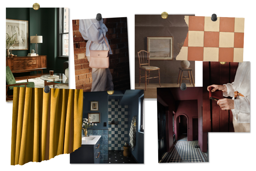
Mood Board #2: "Vintage Revival"
Client Personality: Nostalgic, creative, and thoughtful. This client adores all things retro and loves to collect vintage pieces. They might be dealing with feelings of loss, grief, or identity issues.
How to Design a Website for Them: Embrace warm tones, textured backgrounds, and a hint of vintage flair. Think of retro fonts, classic sepia-toned images, and a website that feels like stepping into the past.
Website Tip: Storytelling is key for this client. Include a blog or space where you can share thoughtful reflections or personal stories that will resonate with their creative, introspective side.
Template Recommendation: Astral is a great choice, as it already has a moody, reflective vibe. If you wanted deeply rich and saturated color, you could easily add them.
Mood Board #3: "Coastal Serenity"
Client Personality: Laid-back, nature-loving, and reflective. This client dreams of quiet beach getaways and is likely working through issues like anxiety, burnout, or boundary-setting.
How to Design a Website for Them: Use light, airy colors like seafoam green and pale blues. Keep the layout simple, modern, and easy to navigate, with a focus on calming visuals like beaches, sunsets, and wide open skies.
Website Tip: Avoid clutter. This client is coming to you for peace and clarity, so make sure your site feels like a retreat from the busyness of everyday life.
Template Recommendation: Inner Peace is 100% perfect for this one!
Mood Board #4: "Urban Grit"
Client Personality: Bold, ambitious, and gritty. This client thrives in fast-paced environments but struggles with overwhelm and the pressure to keep going. They need a space to decompress from the demands of city life.
How to Design a Website for Them: Think edgy, industrial vibes—darker tones like grays and blacks, bold fonts, and straight-to-the-point messaging. Use urban imagery, from street art to city skylines.
Website Tip: This client values efficiency, so make your call-to-action clear and bold. No frills, just results. They want to know exactly what you can do for them.
Template Recommendation: I’d definitely use Audacious! It already has blacks and bold fonts. If you want the template more “gritty” you could change the other colors to neutrals.
Mood Board #5: "Modern Minimalist"
Client Personality: Organized, professional, and loves clean spaces. This client is probably dealing with perfectionism, work stress, or boundary-setting in their personal life.
How to Design a Website for Them: Keep it sleek and polished. Use a monochromatic color palette—whites, grays, and blacks—and make sure every element is carefully chosen. The layout should be clean, with minimal distractions.
Website Tip: Less is more. Give them the information they need in as few clicks as possible. Use concise copy and simple visuals that make navigation a breeze.
Template Recommendation: Clarity doesn’t seem like the obvious choice here, but it totally is! The section divider lines give Clarity an editorial look; all it needs is elegant serif fonts and a quick color palette change. Neutrals and blacks will be gorgeous.
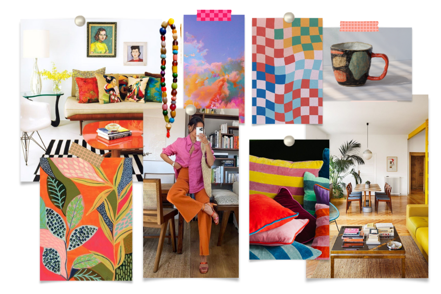
Mood Board #6: "Colorful Eclectic"
Client Personality: Vibrant, creative, and full of life. This client is probably grappling with overwhelm or needing to channel their creative energy in productive ways.
How to Design a Website for Them: Go bold! Use bright colors, playful fonts, and lots of personality. Incorporate quirky design elements that make your site feel as dynamic as they are.
Website Tip: Don’t shy away from patterns and pops of color. Just make sure the structure is clear enough that this creative soul doesn’t get lost in the chaos.
Template Recommendation: Oh gosh, it’s a toss up between Square Peg, Vitality, or Synergy because each of these are primed for lots of color. Square Peg and Vitality are a bit more playful and Synergy, while still fun, has the color toned down a bit in favor of some white space. Regardless, you can’t go wrong with any of these sites!
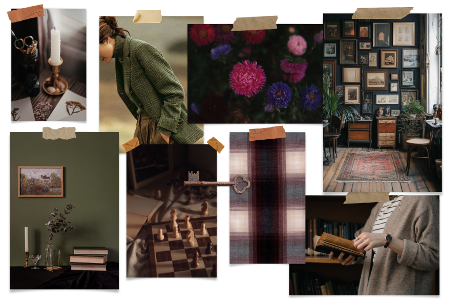
Mood Board #7: "Scholarly Charm"
Client Personality: Thoughtful, intellectual, and loves to learn. This client may be working through self-reflection, personal growth, or identity exploration.
How to Design a Website for Them: Think cozy study vibes. Use warm, rich colors like forest green or burgundy, vintage-style fonts, and plenty of room for content. This client wants to read, so make sure your blog is front and center.
Website Tip: Give them something to dive into—longer articles, resources, or even a book list. They’ll appreciate the thoughtfulness and depth.
Template Recommendation: All the Feels is totally this vibe. It’s got a gorgeous dark and moody color palette now, but it would also look stunning with dark crimson or deep purples.
Mood Board #8: "Soft Blush"
Client Personality: Gentle, nurturing, and aesthetic-driven. This client is likely dealing with issues around self-care, burnout, or perfectionism, and they love calm, beautiful environments.
How to Design a Website for Them: Soft pastels, delicate fonts, and airy designs are the way to go. Use lots of white space and incorporate floral or soft-textured imagery.
Website Tip: This client loves comfort. Make your site feel cozy and inviting, as if they’re wrapping themselves in a blanket when they visit.
Template Recommendation: Vitality or Radiant Roots, are great choices here. All you need to do is swap out the current colors with pastels.
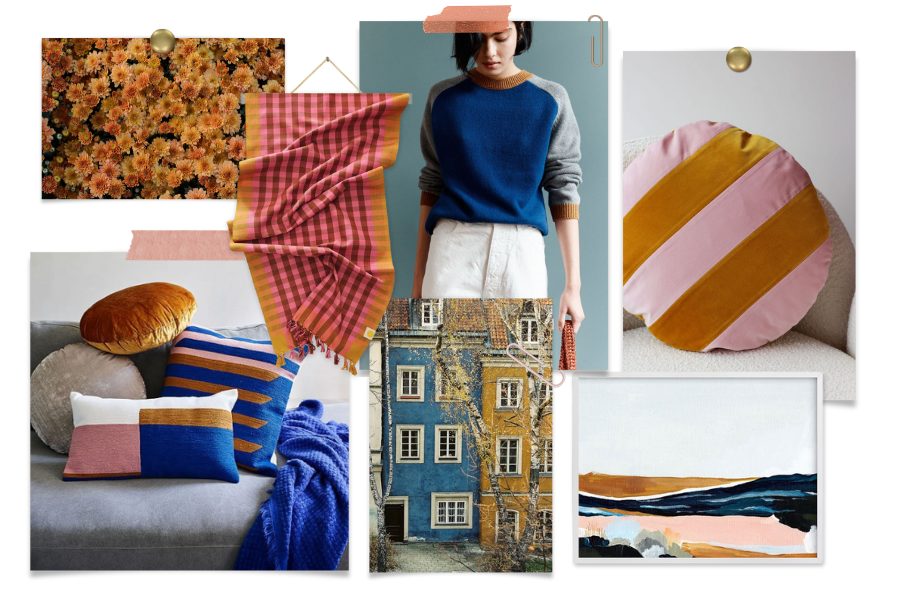
Mood Board #9: "Bold Harmony"
Client Personality: Confident, playful, and unafraid to make a statement. They’re likely working on balancing their big energy with focus and groundedness.
How to Design a Website for Them: Use bold color combos and dynamic typography. Keep the design playful but balanced, with energetic visuals and strong contrasts.
Website Tip: They want to feel inspired by your website, so create a design that feels both empowering and supportive, keeping the visuals lively but the navigation clear.
Template Recommendation: Vitality or Synergy, with the colors on those pillows (lower left) would look freaking awesome!
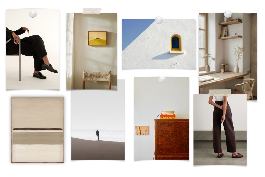
Mood Board #10: "Refined Minimalism"
Client Personality: Sophisticated, introspective, and appreciates the finer details. They are likely working on perfectionism, identity, or personal growth.
How to Design a Website for Them: Opt for muted tones, simple design, and luxurious minimalism. Think high-end gallery vibes with clean lines and no unnecessary frills.
Website Tip: Use plenty of negative space and avoid overwhelming them with content. A few well-chosen images or pieces of text will speak volumes to this client.
Template Recommendation: Awake. Hands down.
Time for You to Try It!
Now that you’ve seen these 10 ideal clients as mood boards, it’s time to give it a try with your own clients. Think about the clients you love working with—the ones who light up your practice. What do they love? What do they struggle with? What would their mood board look like?
Gather a few images, colors, and design elements that represent your ideal client and let this exercise inspire your website design. When you create a site that speaks directly to them, they’ll feel understood and supported before they even walk through your door.
Conclusion
Designing a website for your clients—not just for yourself—makes them feel seen and valued. Use this mood board exercise to guide your design choices and create a site that feels like home to the people you most want to help. Have fun with the process, and watch how it transforms not only your website but also the way your clients connect with you!


