Before & After: How I Transformed Overcomplicated Therapy Brands into Simple, Modern Designs
Before & After: How I Transformed Overcomplicated Therapy Brands into Simple, Modern Designs
When it comes to branding, especially for therapists, simplicity is key. Overcomplicated designs can confuse potential clients, making it harder for them to remember your practice or feel connected to your brand. That's why I took three examples of therapy brands that were struggling with overcomplicated, outdated designs and transformed them into modern, simple, and timeless brands. In this post, I’ll break down the exact changes I made to each brand and why these updates are effective.
Your brand is the face of your practice, and it needs to do a lot of work in just a few seconds—whether someone sees it on your website, a business card, or social media. A simple, timeless brand not only looks more professional, but it’s also easier for clients to remember and trust. Overcomplicated logos, too many fonts, and clashing color palettes can make your brand feel chaotic and less approachable.
Now, let’s check out the three therapy brand transformations I made.
(click the arrows to see the before and after.)
Transformation #1
Energy Alignment Healing Pathways → Align Counseling
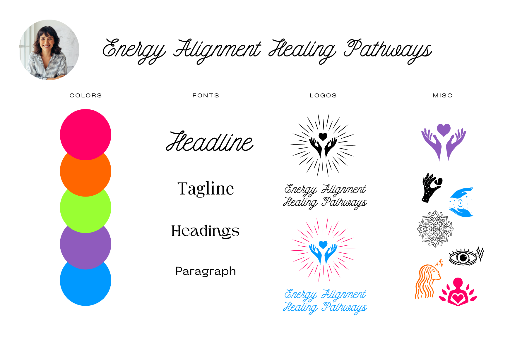
Before: Energy Alignment Healing Pathways
Name: Energy Alignment Healing Pathways is long, esoteric, and unclear. It’s hard to say, even harder to remember, and doesn’t make the brand’s purpose immediately obvious.
Color Palette: Bright neon colors like hot pink, lime green, and electric blue that clash, creating visual chaos.
Fonts: Script fonts everywhere! Thin, curly fonts that are difficult to read, especially at smaller sizes.
Logo: The logo was filled with too much symbolism—hands, a heart, and radiating lines. It felt like the logo was trying to communicate too many ideas at once.
Misc Graphics: Additional icons, including more hands and hearts, were added as extra clutter without much purpose.
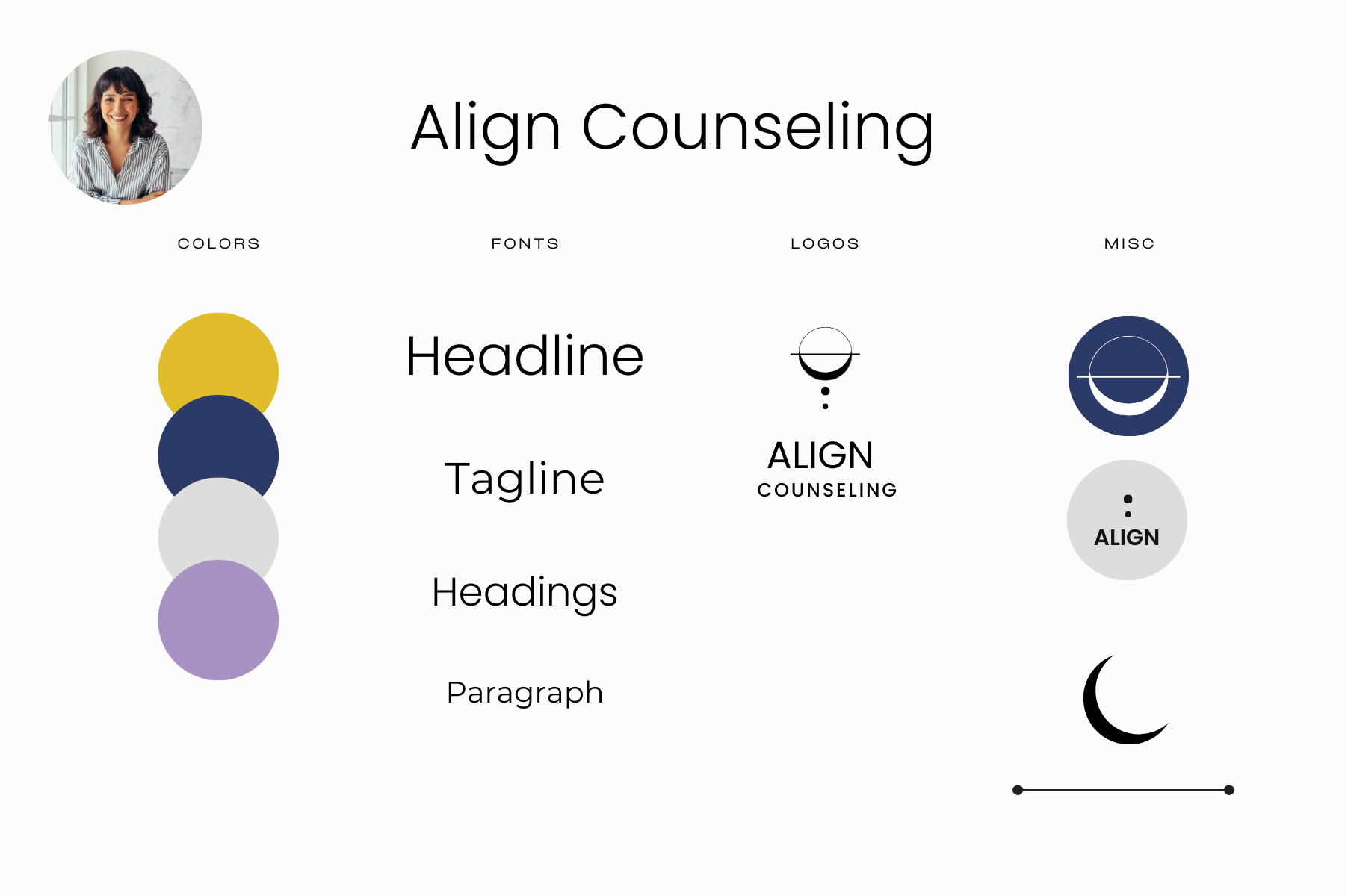
After: Align Counseling
New Name: I simplified Energy Alignment Healing Pathways to Align Counseling.
Why: A shorter name is easier to say and remember. "Align" evokes a sense of balance and wellness, aligning perfectly with a counseling service.Updated Color Palette: I replaced the overwhelming neon colors with a calming palette of navy, gold, and lavender.
Why: The new colors are harmonious and professional. Navy brings a sense of trust and stability, while lavender and gold add warmth without feeling chaotic.Font Changes: The script fonts were swapped for a modern, sans-serif font for the name and body text.
Why: Sans-serif fonts are easier to read and maintain a minimalist, clean aesthetic that speaks to modern design.Simplified Logo: I redesigned the logo as a simple circular geometric shape representing balance and alignment.
Why: The new logo is easy to recognize, works well at any size, and doesn’t overwhelm the viewer with too much symbolism. It’s clean, scalable, and timeless.Misc Graphics: Gone are the extra hands and hearts. Instead, the brand now uses minimal, abstract icons that complement the core design.
Why: Reducing unnecessary elements makes the brand visually clearer and more cohesive.

Transformation #2
The Center for Holistic Wellness & Transformation → Whole-Person Wellness
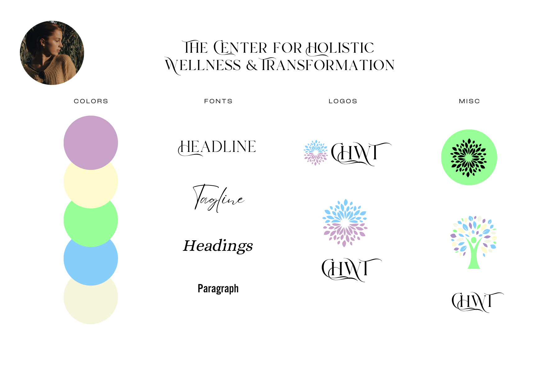
Before: The Center for Holistic Wellness & Transformation
Name: The Center for Holistic Wellness & Transformation is long and clunky. Using this full name often feels impractical, so the therapist opted to use the initials CHWT—which brings its own set of problems.
Color Palette: Soft pastels that lack contrast, making the brand feel washed out and hard to read from a distance.
Fonts: Ornate, serif fonts that feel dated and too delicate for readability.
Logo: The main logo is a mandala shape made up of petals. The details are intricate, but when viewed from a distance, the design doesn’t translate well, losing the effect. The two soft colors used in the logo also contribute to the lack of contrast and readability.
Misc Graphics: The first one creates an entirely different feel—high contrast and clashing with the original soft design. While there is some visual consistency in the leaf shapes, this image feels entirely different from the main logo. The third graphic is simply the CHWT initials, again with the same readability issues caused by the overly ornate, loopy font.
After: Whole-Person Wellness
New Name: Simplified to Whole-Person Wellness.
Why: Shorter and easier to remember, the new name maintains the focus on holistic care while being more practical.Updated Color Palette: Swapped the soft pastels for a warmer, more grounded palette of earth tones like sage green, cream, and charcoal gray.
Why: The new colors evoke a sense of calm and stability while improving contrast for better visibility across all mediums.Font Changes: The loopy script font was replaced with a bold, modern sans-serif font for better readability.
Why: Clear, simple fonts are easier to read, especially at smaller sizes, and give the brand a modern, timeless look.Simplified Logo: I replaced the overly intricate mandala with a single, minimal leaf symbol to represent growth and wellness.
Why: A simple, clean symbol scales well and communicates the brand’s core message more effectively. The previous mandala was too detailed to work well across different platforms.Misc Graphics: The mismatched high-contrast graphic and tree were removed, and I introduced minimal, abstract shapes (like a leaf or circle) to maintain consistency with the new logo and color scheme.
Why: Simplifying and unifying the graphics creates a more cohesive and professional brand identity, without confusing visual elements that clash with each other.
Transformation #3
Inner Journey Space → Helen Kane, LMHC
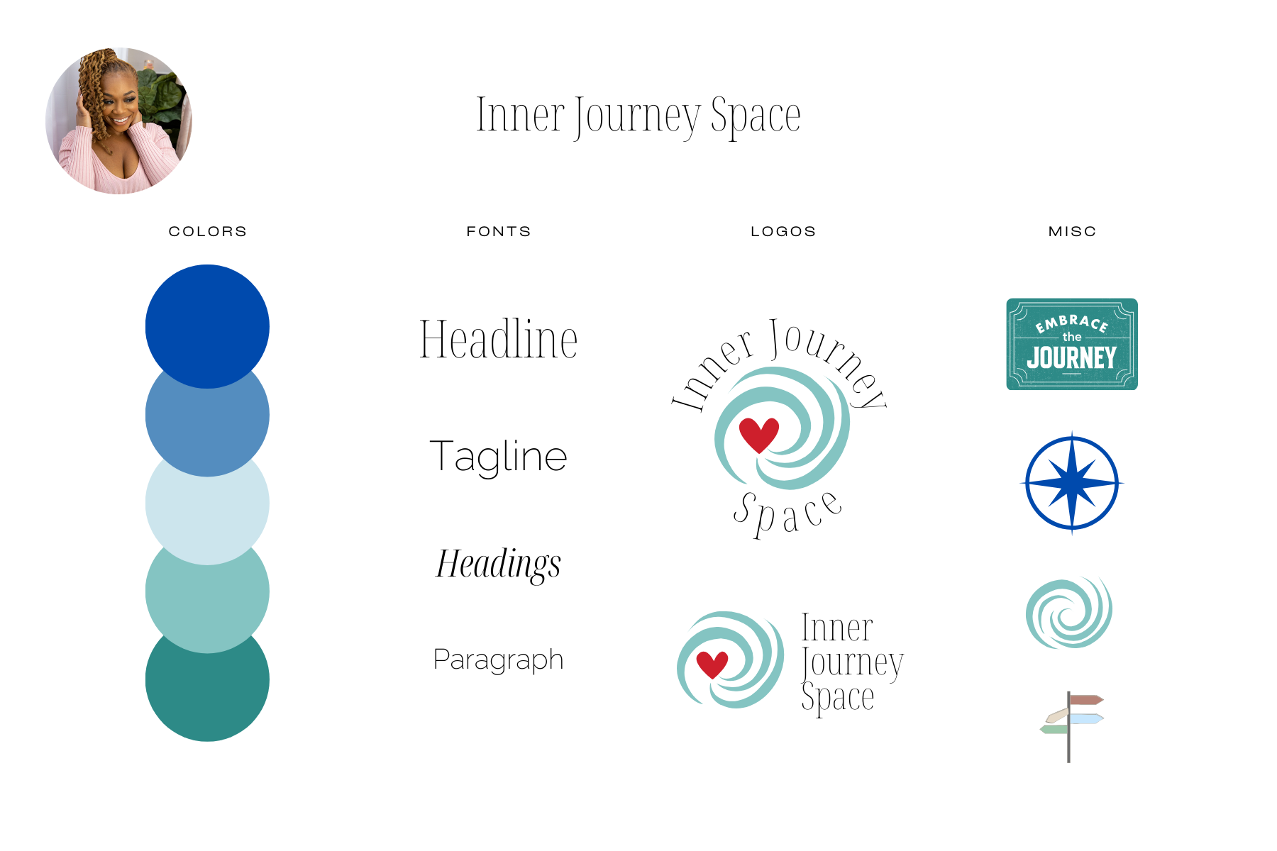
Before: Inner Journey Space
Name: Inner Journey Space feels vague and doesn’t clearly communicate the service. It’s not immediately clear that this is a therapy practice.
Color Palette: A palette of blues and greens, which is very common on therapist websites, making it easy to blend in rather than stand out.
Fonts: Thin, dainty fonts that were hard to read.
Logo: A swirling design with a red heart in the middle, representing a “journey to the heart.” While sweet, it felt too literal and visually overwhelming. The red heart is a prominent part of the logo, yet not in the color palette.
Misc Graphics: A compass, road signs, and more swirls. These added to the clutter and made the brand feel overly symbolic.
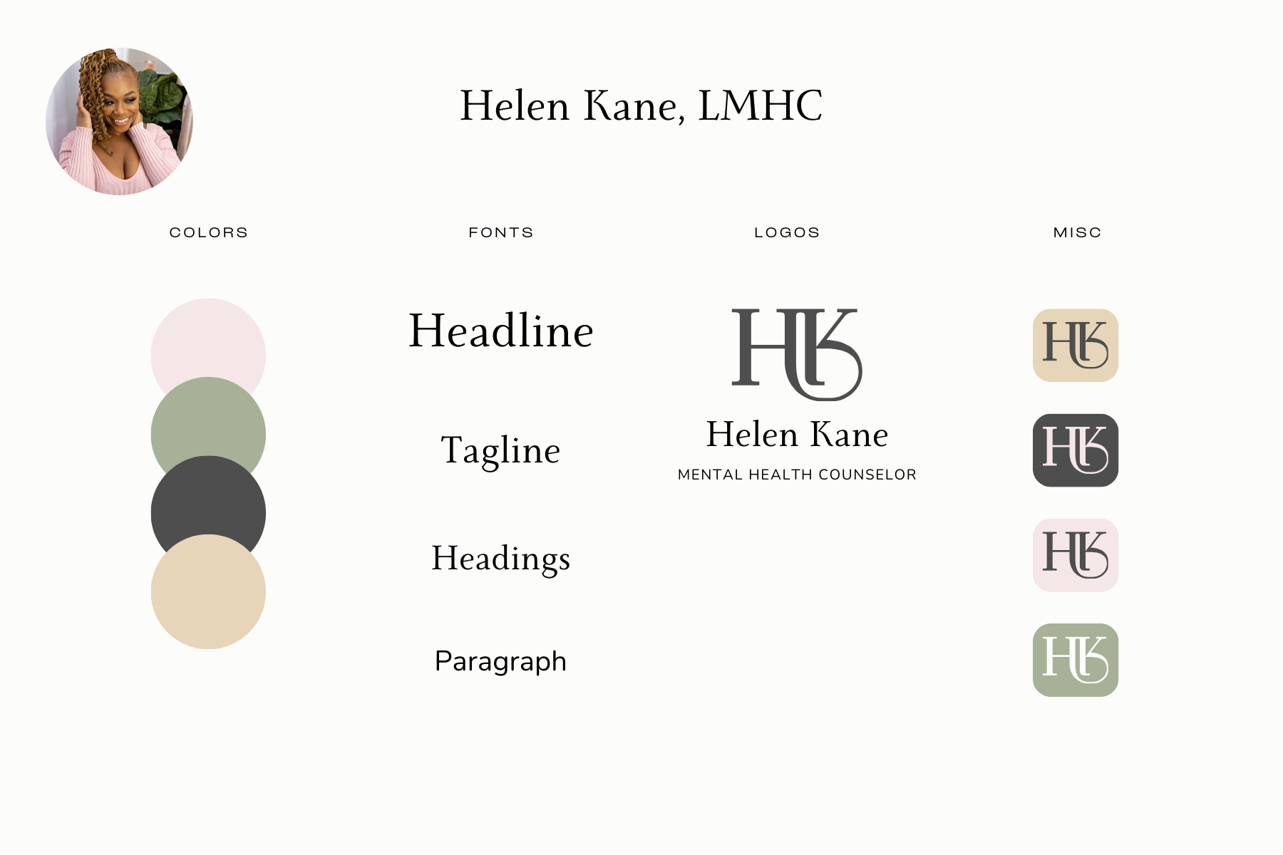
After: Helen Kane, LMHC
New Name: I rebranded Inner Journey Space using the therapist’s name and credentials: Helen Kane, LMHC.
Why: Using a therapist’s name adds a personal touch and builds a stronger connection with potential clients.Updated Color Palette: The common blues and greens were replaced with a soft, neutral palette of sage green, blush pink, and cream.
Why: This unique palette feels warm and inviting, helping the brand stand out from the typical color schemes used by other therapists.Font Changes: I swapped the dainty fonts for a bold serif font for the name and a simple sans-serif for the body text.
Why: Bold fonts give a stronger, more confident feel while still being readable and timeless.Simplified Logo: Instead of a heart and swirl, I created a sleek monogram of the therapist’s initials (HK), which is simple, professional, and elegant.
Why: A monogram is timeless, personal, and versatile, working across all branding materials.Misc Graphics: The compasses and road signs were removed, and instead, the brand uses minimal, elegant shapes to keep things clean and cohesive.
Why: Simplifying the graphics creates a modern, polished look, allowing the therapist’s name and logo to shine.
