8 Exceptional Therapist Websites You Need to See Right Now
8 Exceptional Therapist Websites You Need to See Right Now
Over the years, I've stumbled upon numerous therapy websites, some dreadful, others exceptional. This inspired me to embark on a quest to identify the cream of the crop, those shining examples that seamlessly blend design, copy, and branding to create an unforgettable online presence for therapists.
The Top Therapy Website Examples
To find the top therapy website examples, I solicited from the Abundance Practice Builders Facebook group (no longer active) with tens of thousands of members. I received over 200 submissions. It took me over a month to view all the websites! Thanks to everyone who submitted!
Many details go into a high-quality business website. But for the sake of this article, I focused on three things that I believe should be on all therapy websites. My minimum requirements were:
The site has a professional, clean design that is easy to navigate.
Clear and concise copy gives a sense of identity, attracts specific clients, answers important questions, and illustrates how the therapist will help the client.
The website copy, design, and branding authentically reflect the therapist.
For those who submitted a website that you believe meets the three requirements, I didn't choose your website because it also has one or more things on my pet peeve list.
So, brace yourself for a curated selection of top-tier therapy websites that exude professionalism, authenticity, and a deep understanding of their target audience. In no particular order, here are some of the best therapy website examples:
Millennial Life Counseling
Liz Higgins, LMFT (Founder)
Therapy for millennial individuals, couples, and parents in Dallas, Texas
What a cool niche! “Helping millennials create epic marriages, relationships, and lives” in Texas.” It’s fantastic seeing therapists get away from specializing in a diagnosis or a theoretical approach and focusing on other, more specific demographics or character traits.
At Millennial Life Counseling, therapy seems so cool! It feels less like a stuffy office and more like your favorite coffee shop hangout. Liz Higgins, the mastermind behind this oasis, understands millennials like no other. From hashtags to FOMO, her website speaks your language, offering a refreshing take on therapy. And she prioritized mobile optimization, which makes sense, given the population utilizing these services.
Authenticity is key here, and Liz brings her own personal journey into the mix. Don't miss the high-quality, heartfelt video on the home page, where Liz and her team share their insights on therapy while giving you a virtual tour of their cozy office space. Dive deeper into Liz’s story where she gives you a glimpse into the passion and purpose behind MLC.
But here's the real gem: on the Services pages, you'll find easy-to-understand information that demystifies the therapy process. With a breakdown of evidence-based therapies and a comforting explanation of what to expect, clients will feel like a therapy pro in no time.
Empower Family Therapy
Tina Shrader, LMFT (Founder)
Home-based family therapy in Oak Park and Chicagoland, Illinois
I was first struck by the headline and home page banner video. The headline “Family Time Shouldn’t Suck” is placed over a high-quality banner video of a multiracial family sitting down to dinner. Within 3 seconds, I knew what this practice offered, and I was intrigued.
Empower Family Therapy's homepage copy effectively captures the pain points and struggles that their target audience may be experiencing. They create an immediate emotional connection with visitors by painting a vivid picture of the tense family dynamics and the feelings of helplessness and frustration. The use of descriptive language, such as "walking on eggshells" and "silent avoidant treatment," conveys the intensity of the situation.
Additionally, the copy does a great job of empathizing with the reader's experience and acknowledging their efforts to seek help. By mentioning the reader's attempts to find solutions, such as reading books and searching for therapists online, the copy reassures them that they're not alone in their struggles.
Furthermore, the call to action at the end of the copy is clear and actionable. By providing a step-by-step guide on how to get started with therapy, Empower Family Therapy makes it easy for visitors to take the next steps toward seeking help. Empathy, understanding, and a clear path to finding support can be incredibly reassuring for individuals and families in distress.
The fishbowl metaphor on the What We Offer page is brilliant. The metaphor illustrates the importance of addressing the entire family system in therapy. Just like cleaning a fish won't solve the problem if you put it back in a dirty bowl, focusing solely on individual family members without addressing underlying family dynamics is ineffective. Empower Family Therapists tackle these systemic issues, creating lasting change and empowerment for each family member.
Artistic Affirmations
Leanne Perez, LMFT
Leanne M. Perez's website stands out as a testament to the power of simplicity. Despite its straightforward design and lack of flashy elements, the website effectively conveys warmth, empathy, and hope to visitors. Through concise and relatable messaging, Leanne addresses common struggles her potential clients face, making them feel understood and accepted. The clear value proposition of therapy is communicated without the need for excessive text or elaborate graphics. Instead, Leanne's personal connection with visitors shines through as she shares her own journey and background in a humble yet compelling manner.
Focusing on the core principles of healing and growth, the website demonstrates that impactful communication doesn't require bells, whistles, or trendy design trends. Rather, the message's authenticity and sincerity truly resonate with visitors and encourage them to take the next step toward healing. In a digital landscape filled with noise and distractions, Leanne's website serves as a refreshing reminder that simplicity can be profoundly impactful when connecting with others on a deep emotional level.
Shifting Tides Therapeutic Solutions
Kailee Place, LPC
In-person and online therapy for the millennial woman in Charleston, SC, and all over South Carolina
Shifting Tides Therapeutic Solutions stands out for many reasons. The website notably targets high-achieving, anxious, and perfectionistic millennial women, immediately resonating with its target audience.
This website's authentic and relatable language sets it apart, creating an instant connection with visitors who may identify with the struggles described. Furthermore, Kailee’s casual, authentic tone, use of humor, and the addition of personal details make the website feel approachable and welcoming.
Moreover, the website transparently discusses Kailee’s approach and values. She rejects judgment in therapy, which fosters trust with potential clients.
Kailee’s blog is a delightful addition to her website, adding a touch of personality and charm. Take, for instance, her post titled: “Why Are We So Great and Mindful of Others, But Total Shit to Ourselves? Let's Change That.” I found myself laughing out loud several times while reading through it. Kailee's voice is authentic and relatable, her message strikes a chord, and she effortlessly blends humor, compassion, and presence. Kailee, you’re absolutely killin' it! Could you please blog some more?!
If you haven’t stalked Kailee’s Instagram, you totally should: @shiftingtidestherapy.
Here's a friendly tip if you've found yourself starting a blog but then losing momentum along the way. Consider ditching the dates on your blog posts! Keeping the dates visible might give off the vibe of "old news" to your readers, and that's not exactly a good look.
If you're like me and struggle to keep up with regular blogging, start embracing the power of AI! With AI, you've got a virtual content buddy who can totally revamp your blogging game. You've got plenty of ideas swirling around in your head, so why not boost your website by bringing those ideas to life?
State of Mind KC
Greta Aronson, MS, LPC, CMHIMP
Counseling and psychotherapy for women in Blue Springs, MO
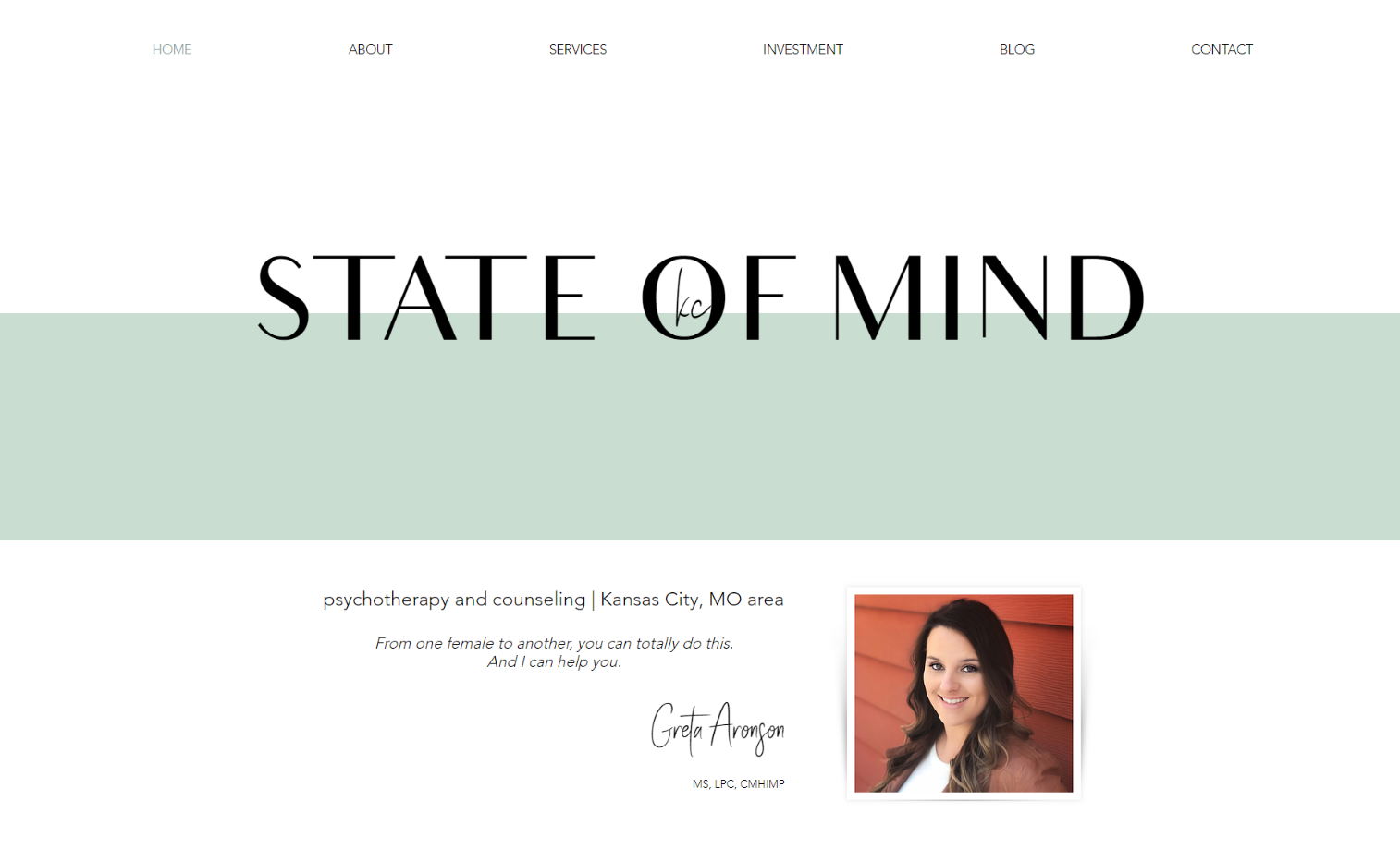
I spent a lot of time on Greta’s website. While her home page doesn’t have a lot of copy and her overall design is fairly minimalist, there was enough to pull me in. Then, as I read through her other pages, I felt more and more connected to her.
Greta’s approach is accepting, empowering, and validating. I learned somewhere that the average person goes to a therapy website 11 times before they initiate services. Greta’s “Philosophy” section alone probably converts potential clients much quicker than that. She says, “Participating in your own life is what’s most empowering,” and “Your new life is going to cost you your old one, and that’s okay.”
Visually, Greta has achieved pastel perfection. The colors remind me of those soft hues you see in a lot of Scandinavian design. It’s clean, modern, and just plain pretty. The use of blank space gives you room to breathe, and the content feels organized.
I immediately noticed that the page with her rates is labeled the “investment” page. I was captivated by the word “investment.” Words like “fees,” “rates,” or “payment” are typically used on therapy websites (which is fine), but I really love how this aligns with Greta’s message about committing yourself. This page also has a beautiful photo with the quote, “there is no better time to invest in yourself than now.” She has completely changed the face of the FEES page! (I’m totally stealing this idea, Greta!)
My favorite copy:
"I just want to be happy."
I hear this all the time. It's a broad statement but, at the same time, perfectly articulates how my clients just want to attain the simple and much-deserved feeling of happiness.
Depression is rude. It barges its way into life, uninvited, and comes in various shapes and sizes, presenting itself in varying degrees – and it’s all gross. Some people can’t get out of bed. Others can function like they always do, but things just feel cloudy for no apparent reason.
No matter where you feel like you might fall on the spectrum, I can tell you this: therapy may be your answer.
Helping Anxious Teen Girls and Young Women Feel Confident and Find Their Voice in Cool Springs, TN
Cody Higgs' website totally nails it when it comes to helping out anxious teen girls and young women. Seriously, if you've been nodding along to those struggles, you're in the right place. He's got your back, whether you're dealing with anxiety, self-esteem issues, or just feeling a bit lost in the maze of life.
What's cool is how Cody talks about his therapy options. Ever heard of Walk + Talk Therapy? It's like getting your steps in while sorting out your thoughts. Plus, he's all about making sure LGBTQ+ folks feel right at home in therapy. His website is totally free of psychobabble or what he calls “big fancy words nobody wants to hear.” That's the kind of vibe we need more of!
I appreciate how Cody spoke to one of the big questions his website visitors might have: Why is a guy working with females? Here’s what he says:
Believe it or not, a male therapist can be really helpful in some unique ways (and in the traditional ways you'd expect from therapy). If you watch enough tv, youtube, Netflix, social media, etc., you can see that girls aren’t always given great messages from or about guys. A male therapist can help show what a healthy male relationship looks like. I work to be a positive male model for appropriate boundaries, active listening, and being sensitive and in tune to feelings. Over the course of my career, this has proven helpful time and time again for many of the young women and adolescent girls whom I’ve worked with. It’s been my experience that girls and women are generally completely comfortable, and we are able to openly and effectively address the issues that brought them to therapy.
And get this – Cody's not just some therapist. He's a dog lover too, with a heartwarming story about his pup Edge. You can tell he's all about that comfort and healing vibe, which makes his practice feel super welcoming.
Therapy for High-Conflict Divorce, Intimate Partner Betrayal, and Love Addiction in Los Angeles, CA
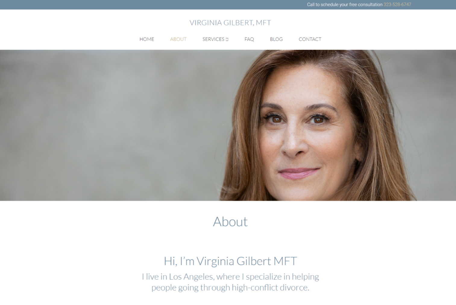
Virginia Gilbert's website stands out for its laser-focused messaging and elegant design. Virginia’s niche is unmistakable: High Conflict Divorce, Intimate Partner Betrayal, and Love Addiction. By addressing specific client pain points and offering compassionate solutions, Virginia creates a compelling case for her services. Her website exudes professionalism and trustworthiness, making it a beacon of hope for individuals navigating challenging relationships.
Virginia's website is like a breath of fresh air in the chaotic world of the internet. It's simple yet stylish, with a design that soothes the soul. The office and portrait photos are stunning. You can tell she's got an eye for detail. Plus, the whole vibe screams professionalism, which is exactly what you want when looking for a therapist.
And can we talk about the copy? It's like a warm hug from a friend you haven't seen in ages. Trust and warmth ooze from every word, making you feel like you're in good hands right from the get-go. And bonus points for keeping things simple with just the right number of pages. Navigating her site is a breeze.
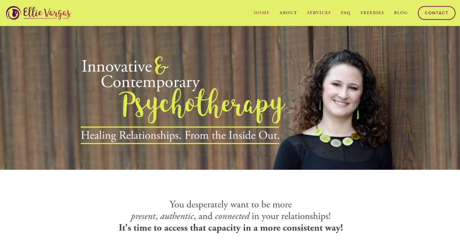
Individual Therapy for “Healing Relationships from the Inside Out” in Berkeley, CA
What's striking about Ellie's website copy is its raw honesty and relatability. She dives straight into the emotional core of her client's experiences, addressing common struggles like relationship woes, low self-esteem, and coping mechanisms like overindulgence. By acknowledging these issues upfront, she creates an immediate connection with her audience, making them feel understood and validated.
One standout aspect of Ellie's approach is her emphasis on healing from within rather than just teaching skills or techniques. She recognizes that lasting change comes from addressing the root causes of emotional pain and trauma, not just applying surface-level fixes. This depth of insight sets her apart from therapists who might offer generic advice without delving into the underlying issues.
Clients would be excited to work with Ellie because of her genuine, down-to-earth demeanor and her personal investment in their healing journey. She openly shares her own experiences of growing up in an alcoholic family, making her clients feel safe to explore their own pasts without fear of judgment. Ellie's transparency, compassion, and commitment to guiding her clients toward authentic connection and self-discovery make her a trustworthy and inspiring ally in the therapeutic process.
Oh, and Ellie’s office is gorgeous. I want to sit in it right now with a cup of tea.
Want to see 5 More Gorgeous Therapist Website Examples? Check them out HERE.
If you’d like to apply to be featured in a future “best of” edition, drop your URL in the form below. Your contact information will only be used for a future “best of” blog article, and will not be sold or shared with anyone.
Need more website inspiration?
There’s lots more in the High Five Design Co. Template Shop!
Some of My Favorite Private Practice Tools
Resources and Referral Links


