Explaining Site Structure Maps and Why You Need One
Explaining Site Structure Maps and Why You Need One
When planning your therapy website, creating a site structure map (also sometimes called a “website content map”) can be one of the simplest yet most powerful tools to help your project run smoothly. By mapping out your site’s structure, you’ll have a clear blueprint for what pages you need, where content goes, and how it all connects. This quick exercise makes the building process easier and faster, and it ensures your site flows naturally for your visitors.
What is a Site Structure Map?
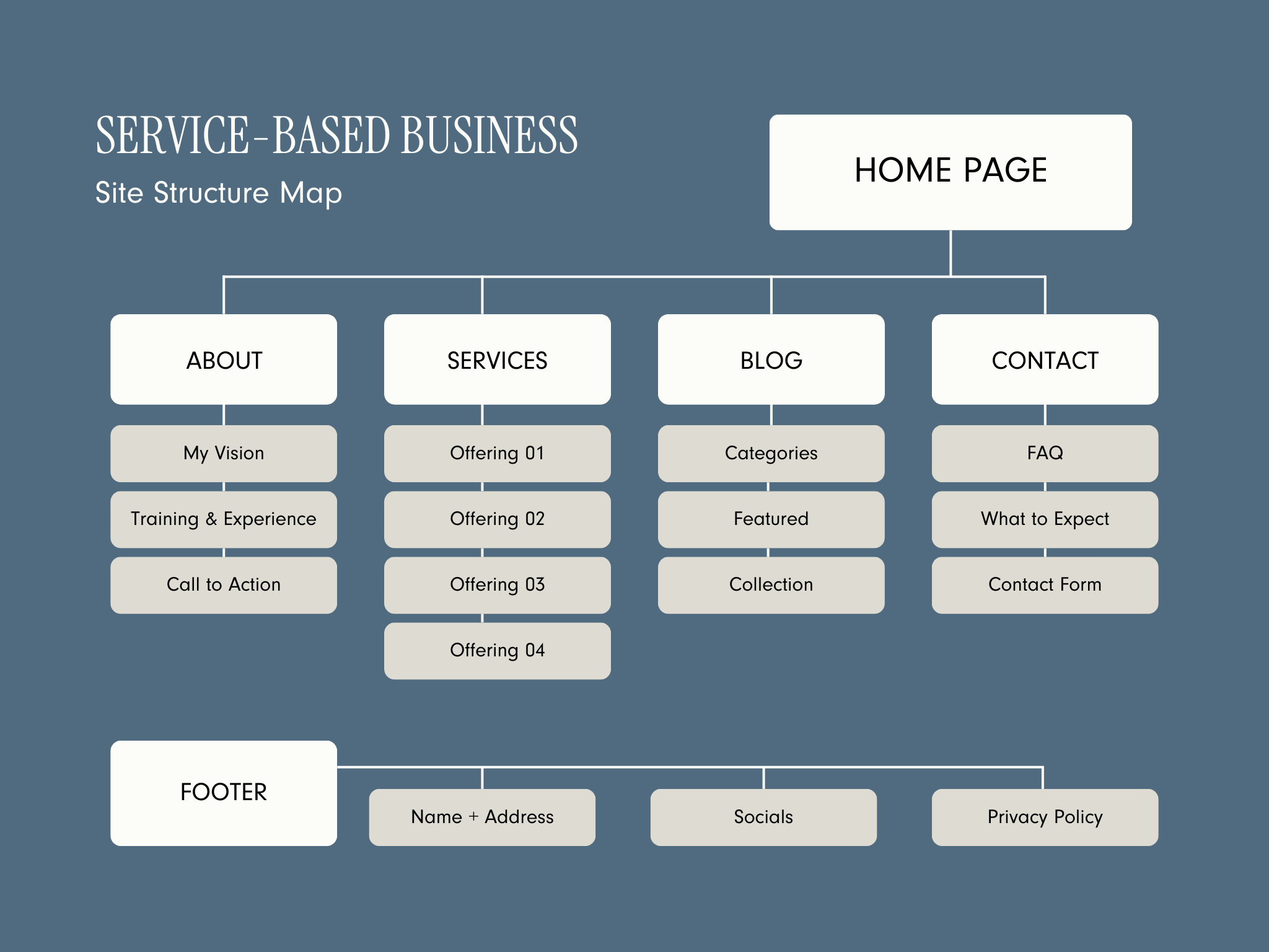
A site structure map is a visual representation of your site’s structure. Think of it as a flowchart or outline that shows the relationship between each page. You’ll usually start with your Home page at the top, then map out other main pages (like About, Services, Blog, and Contact), followed by any subpages. This simple tool helps you see where everything fits and make sure the navigation is logical for your visitors.
Why Create a Site Structure Map?
Streamlines Your Project
Having a clear map before you start building your site means you’ll spend less time figuring out page placement on the go. You’ll have a plan, and that helps things move much more smoothly.
Ensures a User-Friendly Flow
With a mapped-out structure, you can see the path clients will take as they navigate your site. This lets you place the most important pages front and center, guiding visitors naturally from one area to the next.
Keeps Your Content Organized
A site structure map also shows you the “big picture” of your site, making it easy to spot gaps in your content or pages that may need more focus. This is especially helpful if you're customizing a website template or DIY-ing your site because it gives you a clear structure to work within.
How to Choose Your Pages
As you start planning, think about which pages are essential to your site and which might be better as subpages. Here are a few tips:
Main Navigation Pages
Only include the key pages you want every visitor to see immediately. For most therapy websites, this includes Home, About, Services, Blog (if you have one), and Contact. Keep it simple—too many options in the main navigation can overwhelm visitors.
When to Use Dropdown Menus
Dropdown menus work well when you have multiple subpages that logically fall under a main page. For instance, if you offer several types of therapy, you could use a dropdown under Services with subpages for Anxiety Therapy, Grief Counseling, Couples Therapy, etc. This keeps your navigation clean while still showcasing each service.
What to Leave Out of Main Navigation
Pages like Privacy Policy or Terms and Conditions are important but don’t need to be in the main menu. Instead, consider linking these in the footer or on other pages. Additionally, any links for current clients (not potential clients), like links to your portal or online scheduler, should be placed in the footer since your target audience doesn’t need them.
Put Your FAQs on Your Contact Page
If you want the potential client to actually read your FAQ info, then place it on your contact page. They’ll be forced to read it before contacting you.
Sample Website Content Map
How to Create Your Site Structure Map
Now that you know what pages to include, it’s time to map it out. You can create your map in a few different ways:
Digital Tools: Use online tools like Lucidchart, Miro, or even a simple PowerPoint or Google Slides to create a flowchart of your site.
Sketch by Hand: Grab a piece of paper and draw your map! Write “Home” at the top, then draw lines connecting each main page and any subpages.
Post-It Notes (my favorite): Write each page on a sticky note, then arrange and rearrange them on a wall or desk until you’re happy with the structure. This is a flexible option, especially if you want to play around with different layouts.
Final Thoughts
Creating a site structure map is a quick, easy step that will make the rest of your project more straightforward. By organizing your content ahead of time, you can ensure your website flows well, feels intentional, and meets the needs of your clients. So, take a few minutes to sketch out your content map—it’s a simple tool that can make a big difference in how your site comes together!


